Insights
Data Visualization: How to apply it to better understand our business
In the era of information, data visualization has become an essential tool to help us understand the world around us. Every day, we encounter charts and diagrams that attempt to simplify and communicate vast amounts of information. That’s why in recent years, the concept of Big Data has increased, given that large companies manage an ever-increasing volume of information. However, if we do not generate good structures that organize the content and make these data legible, the employees working with them will only obtain immense information that is impossible to interpret.

Okb Interactive Studio
We create dashboards for your businessThis is where data visualization has gained prominence in the last decade, as filtering, structuring, and organizing information through graphic elements not only helps us understand what we are seeing but also generate more accurate interpretations through data comparison at a glance. The latter is very helpful if, in addition, the company has a large number of employees who need to analyze the results without dwelling too much on prior contextualization, thus gaining efficiency in reading the final results.
This process of generating graphics that help us locate relevant data is not something new, nor exclusive to the 21st century; it was implemented two centuries ago to identify problems that would have been undetectable without their visual representation. Throughout this article, we will talk about the importance of the practice of data visualization, from its historical context, to mentioning the most useful visualization methods for both small and large companies, up to the digital present and the new AI tools that have accelerated this whole process, acting as intermediaries between raw data and human interpretation.
The revelation of data
Data visualization is the graphic representation of abstract information with two main purposes. The first is statistics, which can be effectively visualized if design principles derived from understanding human perception are followed. On the other hand, we facilitate analysis through the comparison of the resulting graphs.
One of the pioneers most recognized for his work in visual data representation was the epidemiologist John Snow, who developed the famous cholera map (London, 1854), where he graphically recorded deaths. This helped to better understand the situation and they thus found that the problem came from the contaminated waters of the areas where people were getting sick. This simple act of annotating on a map, instead of doing it numerically through a list, greatly favored the eradication of the problem.

This marked the beginning of the visual importance of data in the 19th century, however, it wasn’t until the 21st century that its use has been widely popularized. As mentioned earlier, in the era of information, we manage a large number of data on which the entire governmental and business system depends. Due to this trend of using Big Data, the needs for understanding and analysis of people who work with data on a daily basis have increased. Consequently, there is a greater demand for improvements in graphics, with the aim of facilitating their interpretation, making it agile and effective.
Better represented data helps to create more understandable narratives.
Raw or unprocessed data can be overwhelming and difficult for the human brain to understand. In contrast, the graphical presentation of data (such as bar charts, pie charts, heat maps, etc.) facilitates comprehension by allowing the human brain to visually process the information. Therefore, better represented data helps to create more understandable narratives, which allows for decisions to be made based on them. Additionally, data visualizations can also help identify correlations and connections that might be overlooked in a raw data set.
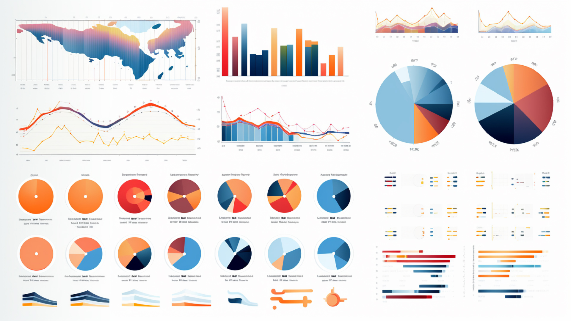
Monitored Vision with Dashboards
Creating a dashboard can be a challenging task, especially in companies that handle a large amount of data. Below, we will mention some key points that could help you create more effective graphics for your company:

-
Define clear goals: Before starting to design a dashboard, it is crucial to understand what its goal is. Is it for tracking sales performance? Is it to monitor operational efficiency? Having clarity about what you want to achieve with the dashboard will help select the most relevant data and metrics.
-
Select the correct metrics: In companies with a large amount of data, it can be tempting to include as many metrics and KPIs as possible. However, it’s important to limit yourself to the metrics that are really relevant to the dashboard’s objectives. This will facilitate interpretation and decision making.
-
Automation: In companies that handle large amounts of data, dashboards must be able to update automatically to reflect the most recent data. This may require integration with the company’s databases and setting up ETL (Extract, Transform, Load) processes to automate data flow.
-
Scalability: Make sure your dashboard design can adapt as your company’s needs change. This could involve having the ability to add new metrics, or to change existing ones, without having to completely redesign the dashboard.
-
Training and support: A dashboard is only useful if people know how to use it. Therefore, make sure to provide the necessary training and support so that users can get the most out of their dashboard.
Data representation with infographics
Infographics aim to simplify information to make it more accessible and attractive, which helps improve understanding and retention of the data being provided. In this article, we will indicate the most important keys when creating high-quality infographics:
-
Define a clear purpose: Before you start designing, you should be clear about what you want to achieve with your infographic. Is it to inform, educate, publicize? Once you know your goal, you can select the most relevant information to include.
-
Focus on the story: An effective infographic tells a story with its data. Try to organize your data in such a way that it leads the audience through the information in a logical and attractive manner.
-
Simplicity: Avoid overwhelming your audience with too much data or complicated graphics. Try to keep things as simple and clear as possible, and remember that the goal is to facilitate the understanding of the data.
-
Iconography and Graphics: Icons and graphics can be an effective way to represent information in an easily understandable manner. Make sure that any graph you use is clear and easy to interpret.
-
Visual Hierarchy: Use design techniques such as size, color, and position to establish a visual hierarchy that guides the audience through the infographic.
-
Readable Typography: Make sure your text is readable. Avoid overly stylized fonts and maintain a font size large enough for comfortable reading.
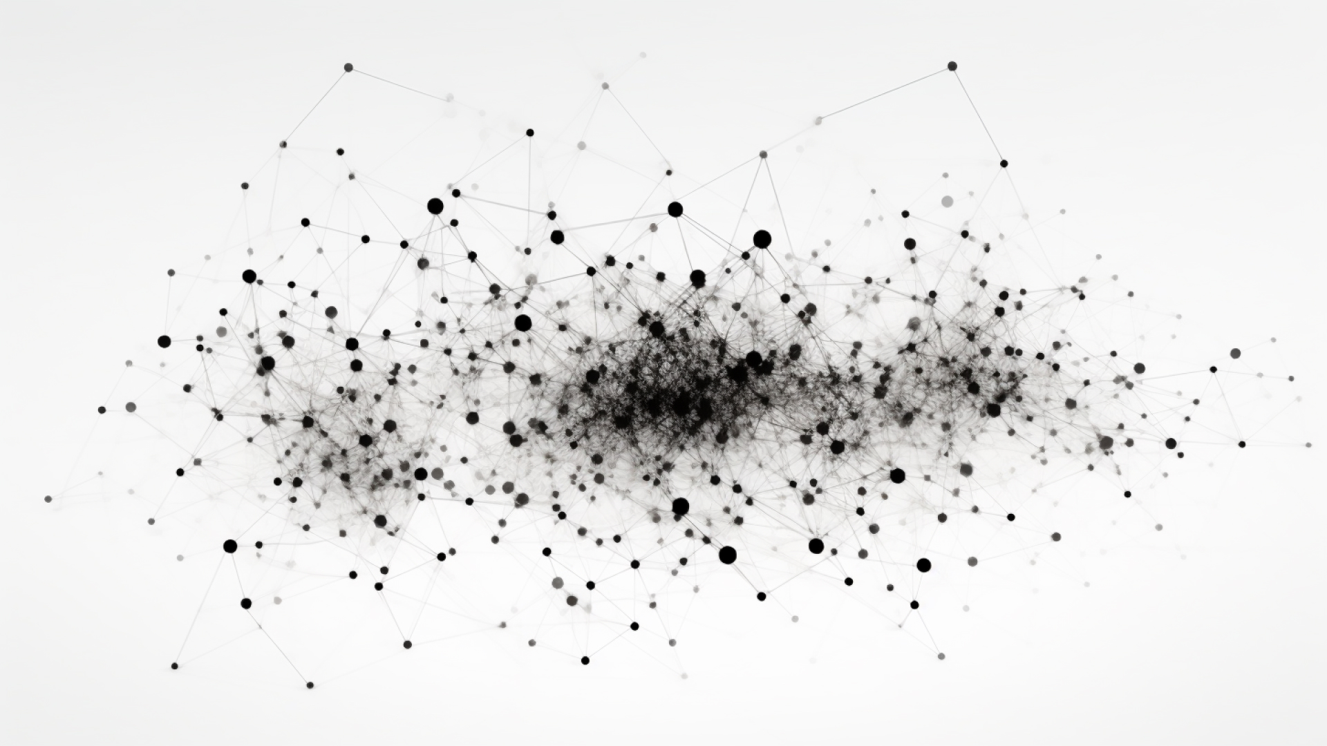
Network Graph Design
A network graph, also known as a graph chart, is a visualization that shows how different nodes are connected to each other. The nodes in the graph represent entities and the lines connecting them represent relationships between those entities. When creating a graph that visualizes more subtle aspects, it is advisable to consider the following:

-
Avoid Overloading: Network graphs can quickly become very complicated if they include too many nodes and edges. If possible, try to simplify the graph by removing nodes or connections that are not essential for understanding the network.
-
Label Readability: Make sure that any label you use on nodes or edges is easily readable. This might involve adjusting the font size, font color, or the label’s background.
-
Node Distribution: The way nodes are distributed in the graph can have a big impact on its readability. Many network visualization tools allow you to adjust the distribution of the nodes to minimize overlap and make the graph easier to understand.
-
Focus on Clusters: Instead of trying to visualize the entire network at once, you might focus on visualizing clusters or communities within the network. This can help highlight the most important connections and make the graph more manageable.
-
Interactivity: If possible, consider making your network graph interactive. For example, you might allow users to zoom or navigate through different parts of the graph, or click on nodes to get more information.
Artificial Intelligence in Data Visualization
Since the beginning of 2023, AI has become the protagonist in the latest advances in digital tools, with the most popular being ChatGPT and Midjourney, which have caused a great stir among their users, who have started to see the numerous advantages they are bringing to their professional routine. All of this is just beginning and that’s why various APIs have already been created with very specific functionalities that help to solve activities that employees found more tedious.
Artificial intelligence and machine learning have also been incorporated into data visualization tools, allowing for deeper analysis and the generation of more useful insights from data. There’s been a particular interest in combining the ability to organize and visualize data with professionals’ skills to break it down and analyze it from a more narrative and human perspective, which remains crucial for understanding the context of the data and making coherent decisions.
Some visualization tools that have already incorporated AI functionalities - Tableau, Microsoft Power BI, Looker, or IBM Cognos Analytics - have served as examples for many of the APIs that have been developed to date, such as Domo, which allows customizing the user interaction experience in real time, facilitating data comprehension from anywhere at any time.
Next Steps in Data Representation
Artificial intelligence is already changing the way we visualize and understand data today, and we can foresee that the future of data graphics, coupled with advances in AI tool development, could incorporate numerous advantages in the business sector. However, it will be important to consider its future impact and study ways to protect data privacy, as well as to continue to rely on the presence of professionals in the sector to provide context and ensure not only that the visualizations are accurate, but also that they are not misleading or marked by biases that harm a good interpretation of the results. ___
As you can see, data visualization in a world increasingly dominated by complex information, has become a fundamental necessity for business structures. We can say that effective data visualization is not merely a convenient tool, but an essential piece in the ecosystem of data-driven decision-making in our current society. We hope this article has been helpful and that you can create better charts in your next data analysis for your business. And if you need help with dashboard design, don’t forget that at OKB Interactive Studio, we can assist you with that.
Did you find this post interesting? Share it!
Your contacts will like to read it, for sure!


