Insights
Transform Your Data Into Information: This Is How Data Visualization Works
In the digital era we currently live in, data has become the most valuable asset. Everything is measured. Our daily activity generates data and these data offer patterns and information that can be very valuable for any company: not only helping to understand current market trends, but even being used to predict future behaviors. However, understanding data correctly is not always easy, so sometimes all the information they contain remains hidden and unexploited.
This is where data visualization techniques come into play, which consist of presenting all these numbers in such a way that they can be consumed in a pleasant, intuitive, and above all effective way. In short, transforming data into information. One of the most innovative applications to take advantage of the benefits of data visualization techniques are dashboards.

Dashboard: what they are and what they are for
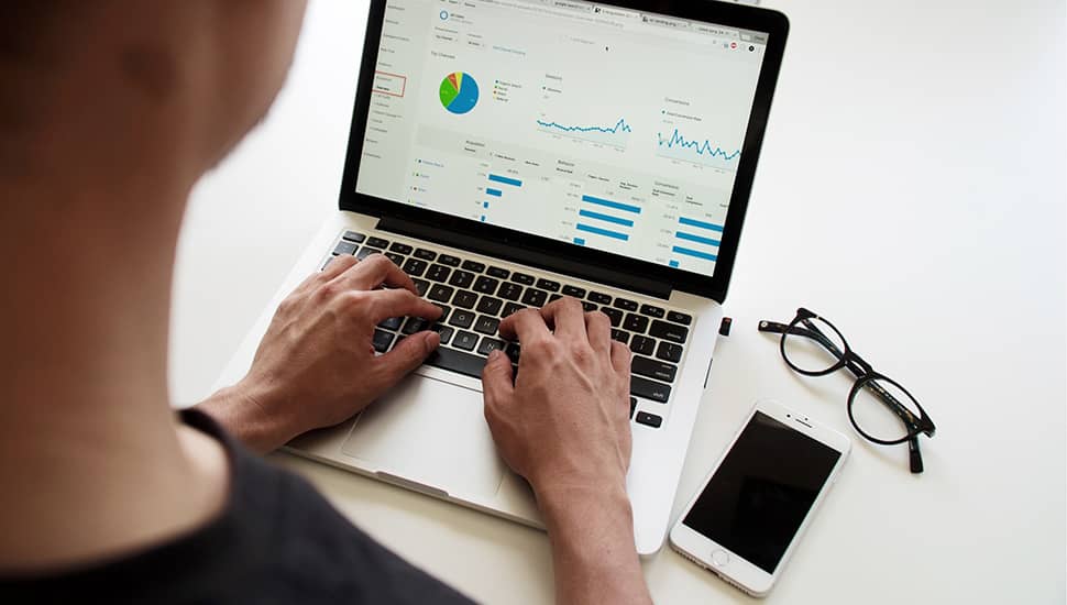
But what is a dashboard and what is it for? A dashboard is an application made up of a set of graphs that offer at a glance useful information about a company and its environment based on a series of data, which we usually call KPIs (Key Performance Indicators).
And how does all this differ from the classic monthly Power Point reports? Basically two things: dashboards are not ‘photos’ of a moment (they offer real-time data) and they are interactive.
Dashboard benefits
Being able to cross-reference data and set filters, dashboards allow you to ‘ask questions’ every time important doubts arise for your business and get answers or simulations in just a few seconds. Let’s say they are living and more powerful tools, compared to traditional reports that become obsolete almost at the moment they are generated.
Dashboards are a tool for making decisions based on data, not intuitions
In short, the main benefit of a dashboard is to better understand the market and to be able to construct solid arguments that lead to decision-making based on data and avoiding intuitions or speculations, something vital in these highly competitive times.
How to design an effective dashboard
Dashboards will only work effectively if they are well designed, carefully choosing each graph and strategically placing them in their place, so that they adapt to the way they will be used by the people involved. When designing any dashboard, it is very important not to forget that the ultimate goal will be to facilitate decision-making for someone. Therefore, before dedicating efforts to a groundbreaking design, what is really important is to always keep in mind the users who will use it and the decisions they will have to make based on these data.
Here we list some tips for designing a dashboard that allows you to make the most of the benefits of data visualization:
-
Use quality data: As we have already seen, data is the backbone of a dashboard, so ensuring that the sources we are using are reliable and accurate is one of the most important steps when designing a dashboard. If the data is of low quality, the analysis we make of them through the dashboard will also be.
-
Simple is not synonymous with simplistic: Dashboards have to be easy to use and a clean and minimalist appearance will help you achieve it. Overloading it with too much data is one of the most common mistakes because the purpose of a dashboard is precisely to prevent the user from drowning under a deluge of data. Over-information is as negative as misinformation, because if the data are too difficult to decipher, users will perceive it as a waste of time. This does not mean that dashboards have to be simplistic, but they should allow quick visualizations to a wide audience while more advanced users can delve into the tool to obtain more information.
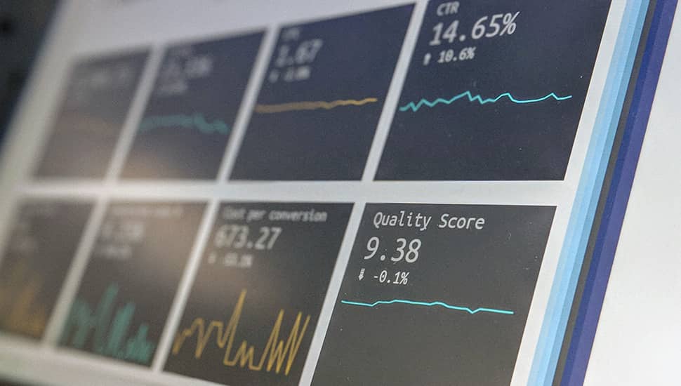
- Select the right type of graph for each data: There are many types of graphs and choosing one or another is not merely an aesthetic decision, but you need to know when they should be used depending on the data to be represented. Classic bar charts (horizontal or vertical) generally seek to establish comparisons, while line charts (also known as fever charts) are often used to show the evolution of one or more data over a specific period of time. On the other hand, pie charts (or doughnut charts if they present a hole in the center) should only be used to represent parts of a whole, that is, when the sum of all the portions equals 100%. Like bar charts, maps are also used for comparisons, but they are especially useful because at a glance they allow users to get an idea of how an indicator is distributed over a specific territory. Tables can also be considered as a type of chart, although they are recommended when what you want to achieve is not so much a visual effect but the transmission of more detailed information.
Pie charts should only be used to represent parts of a whole
-
Use colors to your advantage: The choice of colors in charts is also very important. On the one hand, we must not forget that colors culturally have their meaning and this helps us better interpret the data. For example, numbers in green we automatically perceive as positive, while red numbers we usually identify with bad news. It is also important that the combination of colors used is harmonious, as well as maintaining consistency: if one of the KPIs you are using (for example, the number of visitors to a campaign) you have represented in a color (for example, blue), always using the same color each time you represent it will help your users to better locate that KPI and interpret your graphs.
-
Use hierarchy: The most important data of your dashboard are the KPIs that allow measuring the performance of your company, and therefore they should appear prominently at the top of the dashboard.
Dashboard Tools
Dashboards can be developed as proprietary web applications or using some of the data visualization tools currently on the market:
- Tableau: Tableau (from the Salesforce group) is probably the leading tool in terms of data analysis and visualization platforms. With Tableau you can connect various data sources to your dashboard and its main advantage is that it is easy to use. In addition, there is a lot of documentation and a large community of users.
- Google Data Studio: Although initially it was thought of as a complement to Google Analytics, in 2017 it became a fully autonomous data visualization tool to which we can connect both Google databases (Analytics, AdWords, Search Console…) as well as other external sources. Its main advantage is that it is a totally free application.
- Microsoft PowerBI: Power BI is a widely used solution for creating dashboards. It currently has about five million users.
As you can see, data visualization techniques can help your company make better decisions. Do you already use data visualization in your company? At OKB Interactive Studio we design dashboards completely customized so that you can take advantage of all the benefits that this tool offers you.
Did you find this post interesting? Share it!
Your contacts will like to read it, for sure!


