Insights
Creating an effective development handoff with Figma
Web prototypes are not only used to communicate with our clients, but they are also an important tool for internal communication between teams, since once approved by the clients, they pass from the designer to the developer, who will be in charge of making them a reality. So why not optimize these prototypes to facilitate this development handoff? Not only will you improve the time and the relationship between teams, but also the final product will be more solid and will always live up to the expectations that the client has formed during the design phase.

As a general rule, putting ourselves in another’s shoes always helps us be better in life. This also holds true for the specific topic of this article. We are pointing out that, when creating a web design, as designers, an important part of our job is to be aware that at some point our work document (in our case a Figma document) will leave our hands and will be the reference a developer uses to build a site: all the information must be clearly depicted in it, as anything not present (or that is unclear) in the document will not be implemented. This is especially crucial in companies where the design and development teams are physically distant (on separate floors, different buildings, or even in different countries).
In this regard, it’s quite helpful for designers (though not strictly necessary) to have some knowledge of development. This will allow us to understand what a developer specifically needs. Additionally, it will enable us to estimate what is feasible in the design and determine whether what’s designed can be achieved within the client’s timeframe and budget, two aspects that must be carefully considered and that we can never allow to become an issue for the development team due to poor planning. For this reason, although at OKB Interactive Studio we have different specialization areas, we’ve always championed versatile profiles that allow us to provide a comprehensive perspective to all our projects, from conception to delivery.
However, regardless of the above, it’s advisable that the design and development teams be close. Unfortunately, this is often not the case from what we’ve seen. And when we say close, we don’t necessarily mean physically close: thanks to the features of Figma that we’ll discuss in this article, we can ensure design projects are accessible to the development team during their creation, allowing them to have their perspective and become more familiar with the project when it reaches their hands. This way, questions can be addressed throughout the process instead of only at the end. Once the document is ready, there are best practices that allow us to properly prepare files to ensure the development handoff is as efficient as possible. Let’s delve into them…
How to organize your projects in Figma
As we’ve said more than once on this blog, there’s no ‘official’ way to organize projects in Figma. What makes this tool genuinely intriguing is its vast flexibility, meaning there are many ways projects can be structured: the best approach will be the one that caters to the specific needs of your company, your team, and your product. However, whichever approach you choose for organizing your projects, it’s crucial to follow certain guidelines.
The first one is to always use the same structure across all your projects. This will help developers (or other designers) know where to find what they’re looking for.
Another tip is to break the project down into more manageable parts (files). Even though it might be tempting to include an entire project’s design in a single file, the truth is that -except on rare occasions and for very simple products- this approach results in exceedingly large and complex documents where locating anything becomes a challenge.
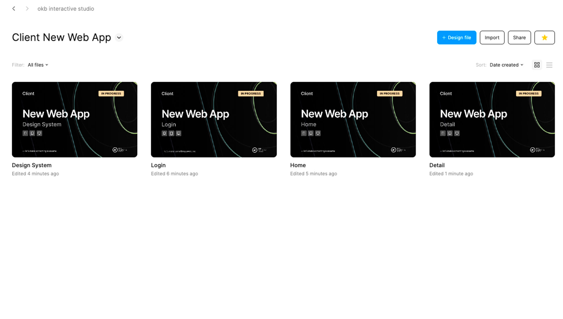
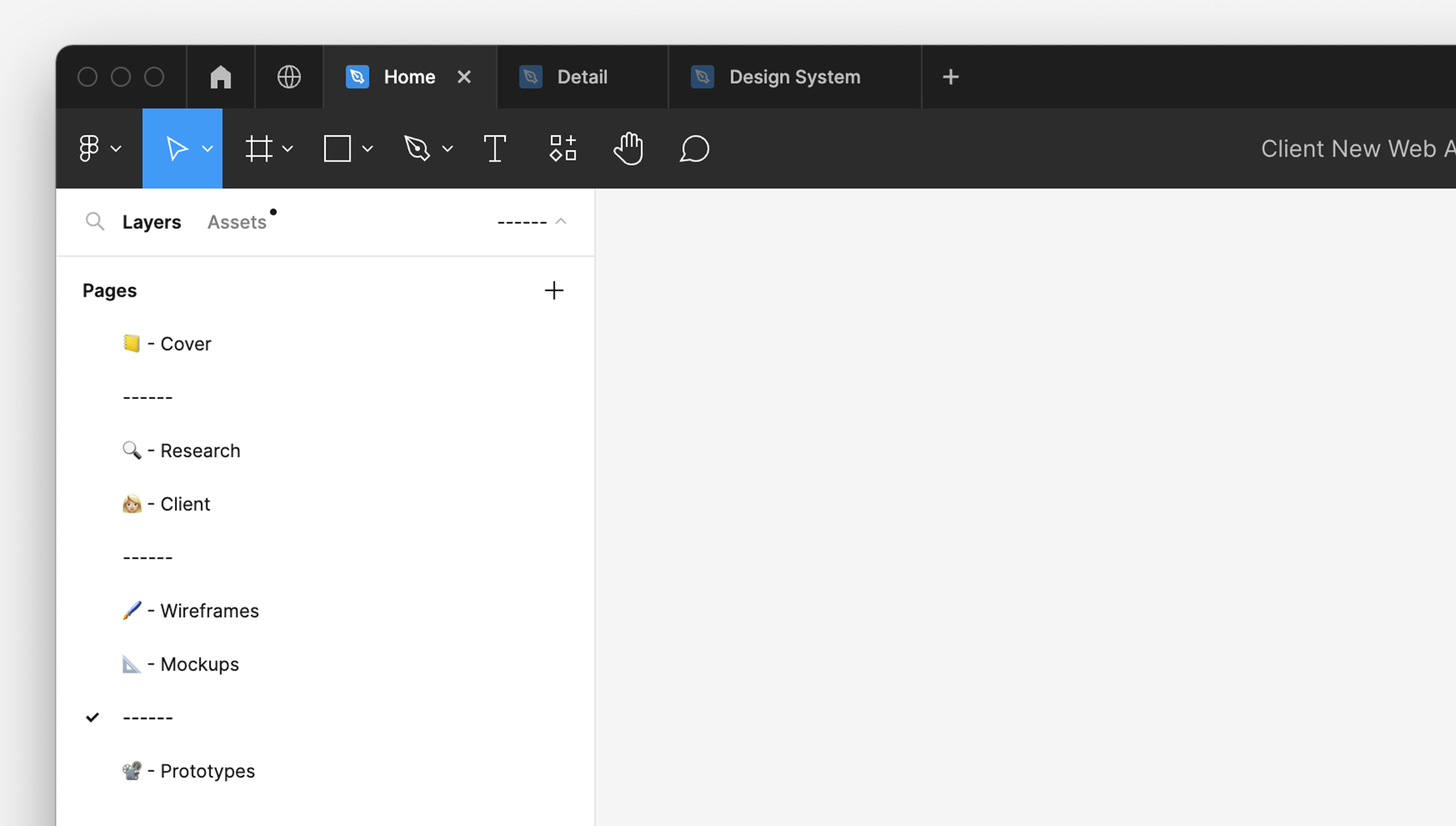
Within the files, we can create pages for the same reason: to separate work and avoid the accumulation of excessive frames. This page structure might be comprised of the cover page (with a thumbnail and basic file information for easy recognition in the file explorer view), the research (a moodboard to store ideas that might serve as inspiration), client documentation (content shared with us for the project), an experimentation area (where initial ideas begin to take shape), the work-in-progress (where the design starts coming together, refining details and utilizing components and variables), and the final prototype (featuring pages that have been validated by the client, ready for developers to locate and integrate).
Follow the same methodology for design as for development
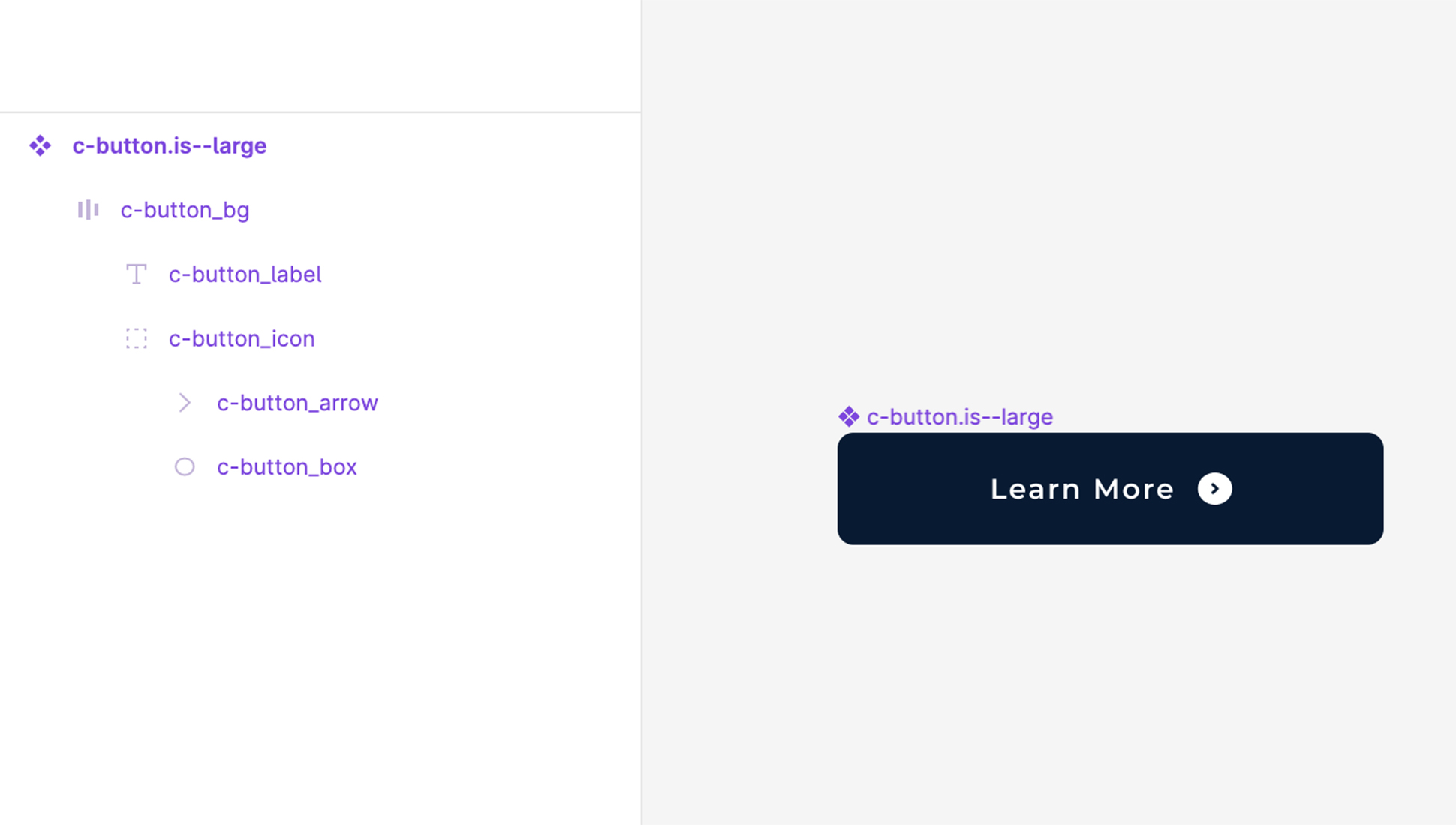
For an effective development handoff, having designers and developers follow the same work methodology is as beneficial as them speaking the same language. For instance, most developers (as is the case with OKB Interactive Studio) typically work following an atomic design methodology, which breaks down a page into smaller repeatable elements that are combined in various ways to create new elements. Their fundamental tools are tokens and components, so it’s very helpful for designers to also use these concepts when designing in Figma, carefully planning the design system to create repeating patterns. This ensures that developers don’t have to apply specific classes and styles for a single element, thus optimizing the code and the time invested.
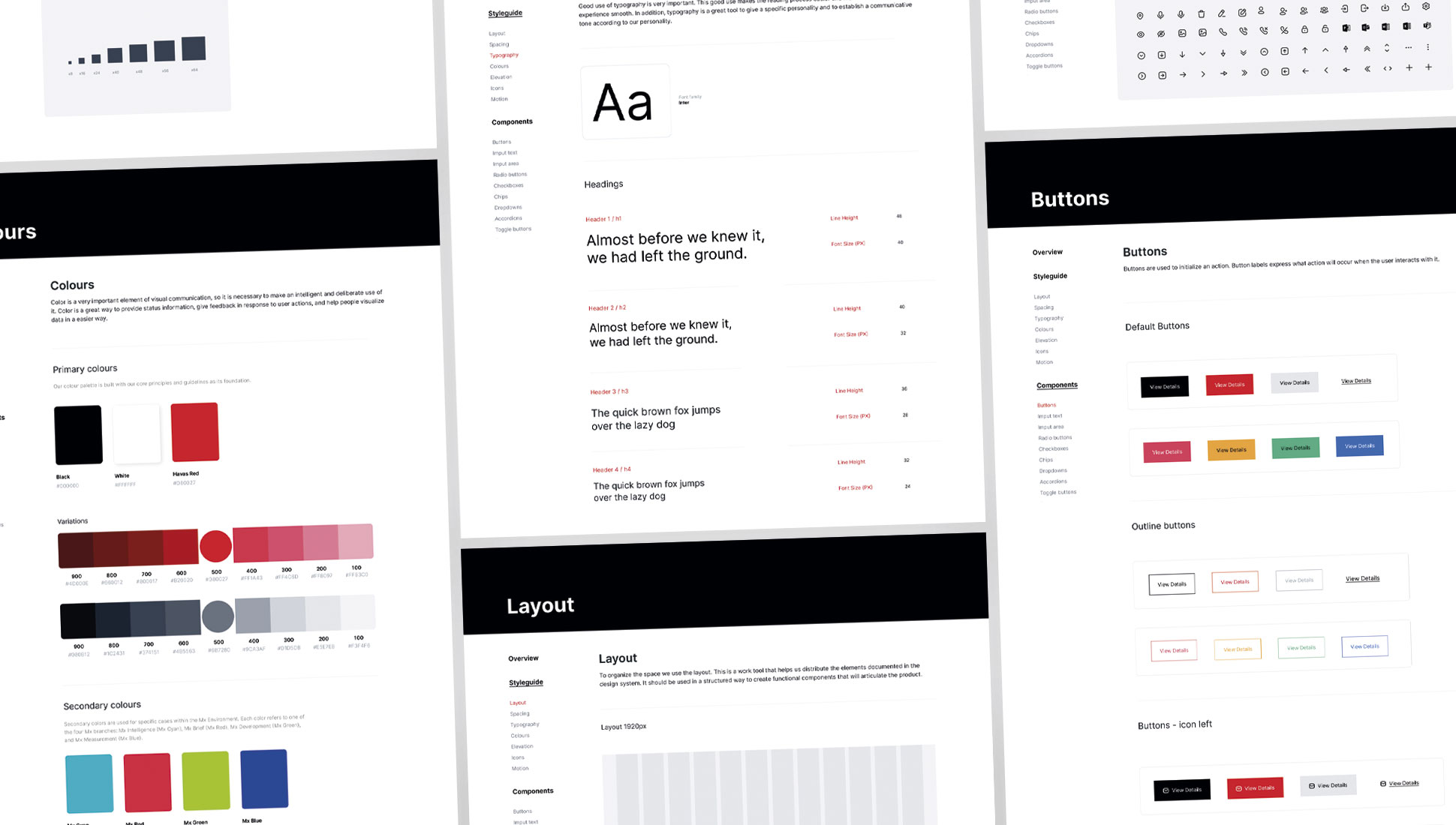
Following this same logic, Figma allows users to apply styles and create components and then reuse them throughout the design as instances. When a developer selects an instance, they can go directly to the file containing its master component. Therefore, it’s highly beneficial for designers to include all the documentation next to them that might be useful for the developer, such as the name, a brief usage description, its various states…
Never move a prototype to development without including responsive version
A designer should never leave it to the developer’s intuition to know what will happen to content when the screen resolution is significantly reduced, especially when currently 54% of internet queries around the world are made via mobile phones (compared to 44% from computers and 2% from tablets). However, it’s still common for developers to receive prototypes only in their desktop versions, when your Figma file should include versions of each screen in four resolutions: mobile (for mobile phones about 360 pixels wide), tablet (for vertical tablets around 768 pixels), laptop (for small screens of 1280 pixels) and desktop (for large screens of 1920 pixels).
Where’s the best place to locate these resolution versions? Always consider the workflow. For instance, at OKB Interactive Studio, we place them all together on a single page because it’s more convenient for both designers and developers, who often work with them simultaneously. Separating them can necessitate jumping back and forth between pages or files, disrupting the workflow.
A good prototype should include all the states
Just as it happens with designing prototypes solely for desktop, another common pitfall among designers is focusing only on creating screens that represent the ideal and default state in which content is displayed. For instance, it’s easy to design a carousel of cards when the text of each is placeholder text, perfectly formatted so all have the same length. But what happens when the content is unbalanced? Is an ellipsis used? Is the card size increased? As designers, solutions must also be provided for these scenarios (which will undoubtedly occur once the project moves beyond the idyllic design phase) so that the developer can account for them in their code and not have to improvise.
Other scenarios also need planning, such as error and success states (which describe if a specific task has been successfully completed, like filling out a form’s fields), the loading state (which shows how a screen looks when waiting for an action to be completed or for its content to load), or the blank state (which portrays the appearance of a screen when there’s no content to show, for instance, after performing a search and getting no results).
The same goes for interactions: every design in Figma should include how elements look when users interact with them, be it clicking or hovering over them.
Versioning and validations to developers
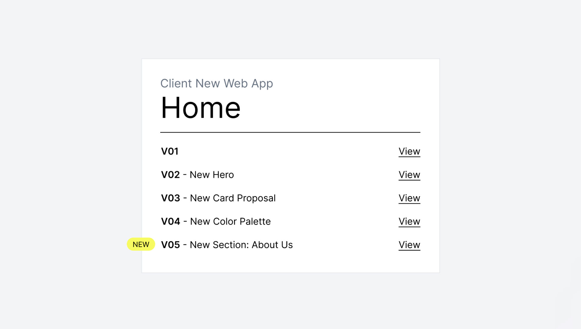
As we’ve mentioned before, the design of a web application involves many changes. These changes are typically not made on a single design, but rather in versions, since there’s always the possibility of reverting to something previously discarded or often, some changes are just tests the client needs to visualize a concept. As a result, by the end of the design phase, a Figma project can house dozens of screens.
That’s why it’s crucial that all these versions don’t land on the developers’ plate; otherwise, it will be challenging for them to identify which version is the final one (which doesn’t necessarily have to be the latest). So, our advice from OKB Interactive Studio is always to separate design files from production files, as we’ve discussed when talking about pages.
Furthermore, within the prototype shared with the client, at OKB Interactive Studio, we include a frame that serves as a version control for a single page, indicating which versions are new and, if one exists, which version is approved, thus avoiding confusion for both clients and developers.
This process becomes more complex considering that the design and development phases aren’t always consecutive. Often they overlap, with the development team working on some screens while the design team is finalizing others with the client. That’s why it’s helpful to establish a code that communicates to the developers which parts of the prototypes are ready, which are awaiting validation, and which are still being worked on, using, for instance, tags, colors, or emojis on the Figma file frames. Any code is valid as long as it’s easy to understand and shared by all involved teams.
Use descriptive names on your Figma development prototypes
Naming the different frames in a Figma document serves several purposes:
- To make them easily locatable.
- To make them unequivocal.
- To be descriptive to help understand what they represent.
You can use any naming convention you want, but remember, a name only makes sense if all teams use it.
But it’s not just about naming the frames. Naming the elements of each layer is also important, perhaps not during the initial ideation phase (since there’s no need to communicate with other teams) but certainly once the design starts solidifying and advancing through validations, and especially before development handoff. It might be worth naming the Figma layers according to the classes developers will use later. For instance, at OKB Interactive Studio, we employ the BEM CSS naming convention (Block, Element, Modifier) to define HTML node classes. Thus, it’s a good idea to use this methodology when naming layers in Figma. Thanks to Dev Mode, developers can fetch HTML and CSS code from elements previously designed with the names they’ll use, serving as a foundational basis.
Designers and developers: keep in touch!
Sometimes, as a designer, you might have a clear vision of how a particular element should behave. But even if it seems evident to you, it might not be so apparent to others, like the developer tasked with implementing it.
It’s true: conveying an idea precisely in a design can be challenging. But Figma offers a handy commenting feature. With it, you can document all those points that arose during the design, especially those the client emphasized and worried about most. Overlooking these concerns in the development phase (even if unintentionally) reflects poorly on the studio in the eyes of the client. The key is to explain everything as you’d like it explained to you. It’s best never to take anything for granted…
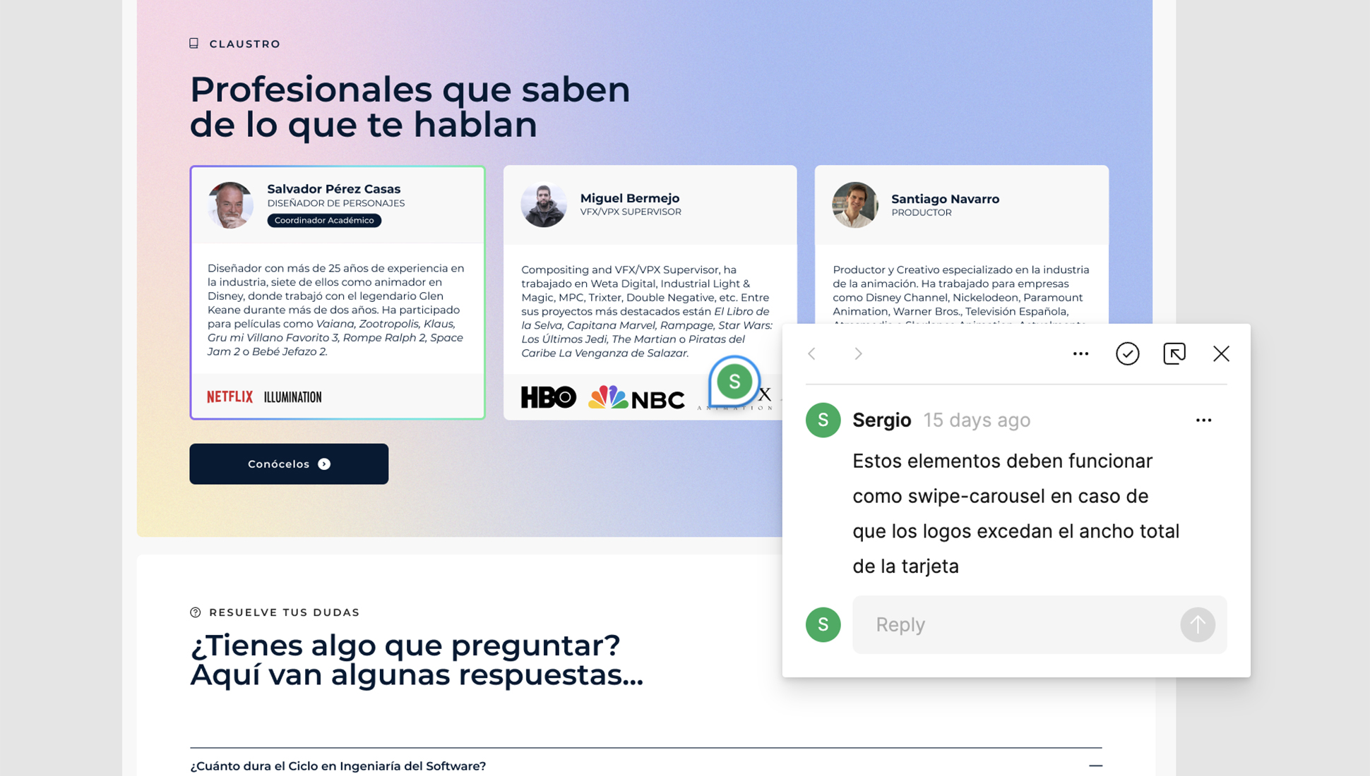
But this tool isn’t one-way. It also allows developers to voice their concerns about the design during the development process. Posting comments directly in Figma rather than resorting to emails or tickets is, in our view, a more practical form of communication since they provide context. Moreover, Figma goes one step further with an audio chat feature, where designers and developers can directly converse if a written inquiry becomes too convoluted.
Always include a navigation map for developers
Lastly, having a clear understanding of how many pages make up the application, their names, and how they relate will be very useful for the developer, especially if the web application is complex or boasts a high number of screens. Including a navigation tree doesn’t take much time but greatly facilitates the job.
Organizing files may seem daunting initially. But ensuring a smooth development handoff is very beneficial for your company. It not only streamlines the work and ensures important details don’t get lost, but it also prevents tensions between teams. In this regard, Figma is an invaluable tool with its collaborative spirit, challenging the traditional view of design and development as isolated compartments. In reality, they are two parts of a single process that should remain integrated. The more integrated they are, the better the results.


