Insights
How to design user interfaces for digital kiosk
Since the arrival of the first smartphones, touchscreen interfaces have dominated our daily lives. Today, we’re accustomed to performing nearly all our interactions through screens: shopping online, managing tasks that used to be face-to-face, and even communicating more through screens than in person. As a result, many businesses are looking to translate this digital experience into the physical realm using digital kiosks.

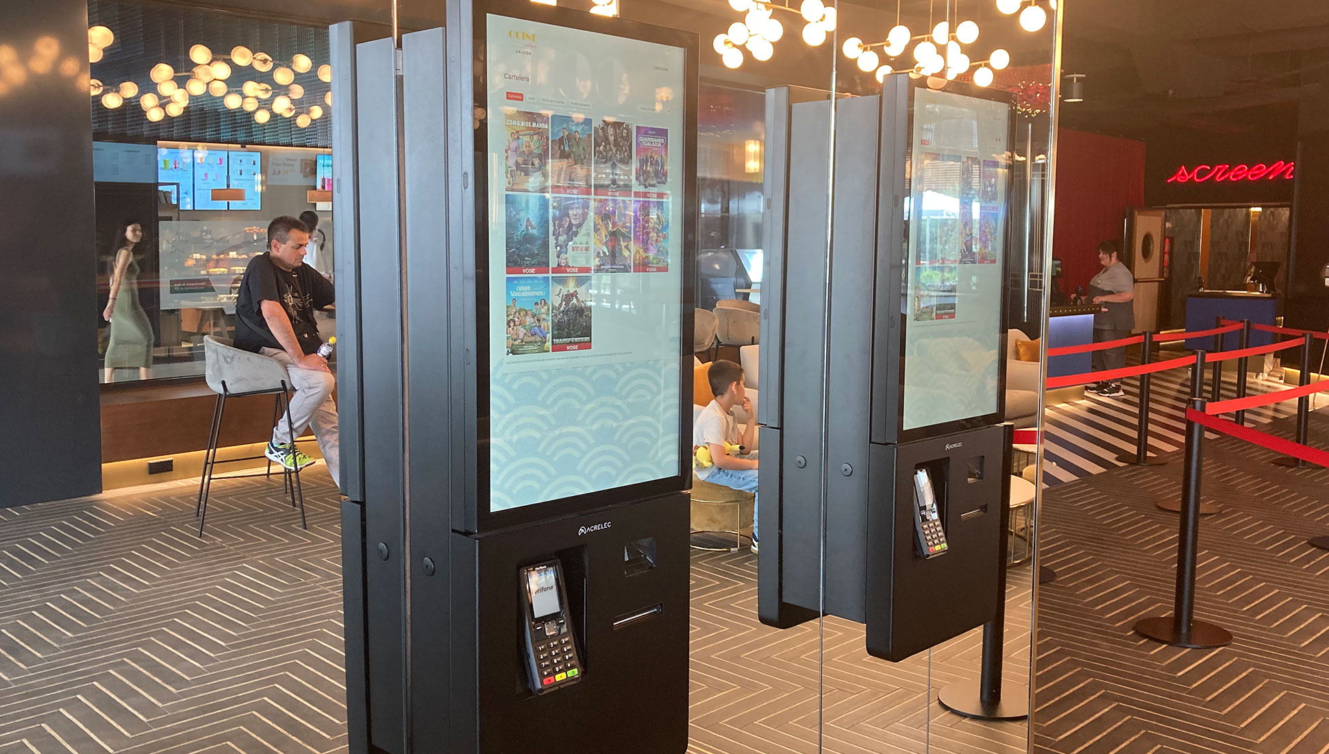
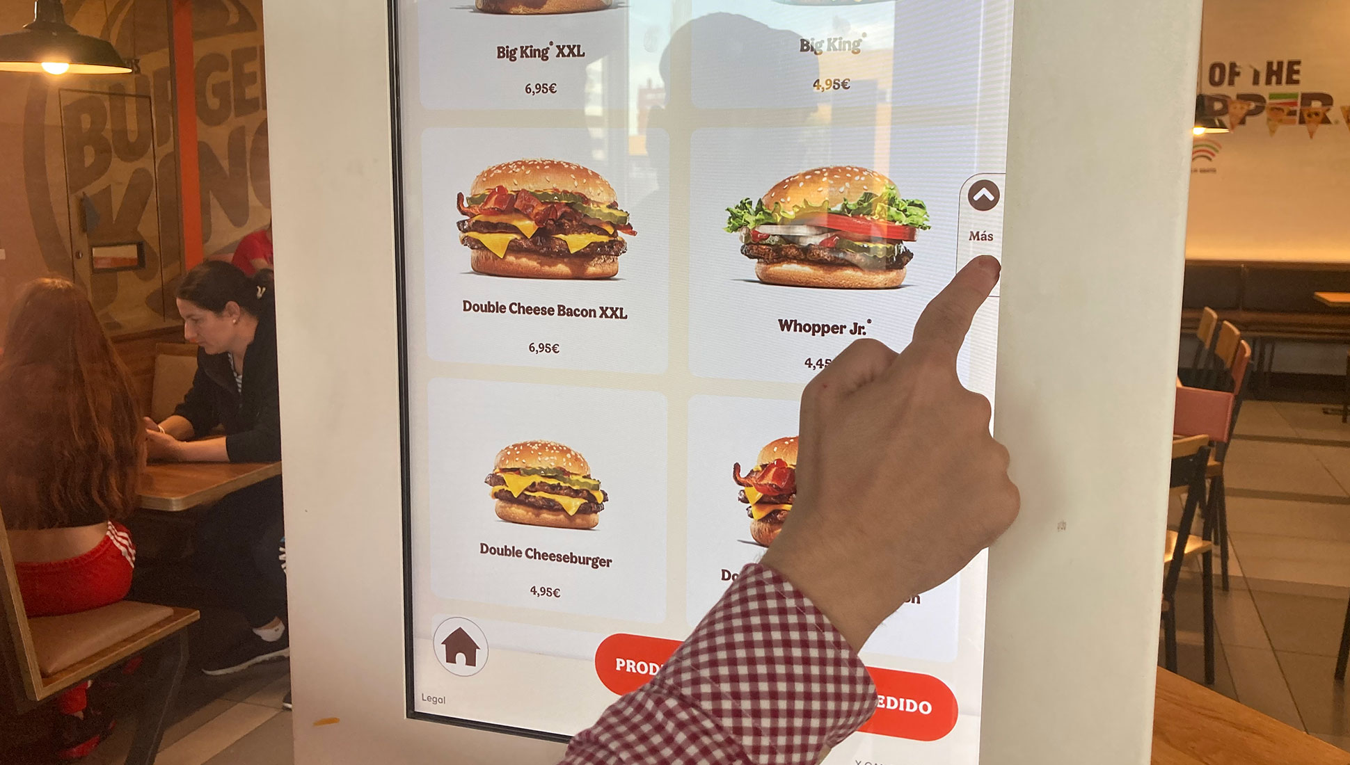
A digital kiosk is a screen placed in public spaces, allowing passersby or business customers to interact with a customized interface offering various services. You’ve probably used one because they’re becoming more common across all types of businesses: perhaps you first encountered them as information points in malls, or as the check-in machines airlines have used for passengers to print boarding passes. More recently, you might have seen them in some restaurant chains for placing orders. We’ve also used them in hotels—for check-in and check-out—and in cinemas and museums for ticket purchases. Some stores even have kiosks where customers can order specific items or sizes from their e-commerce and even finalize the purchase they made in the store.

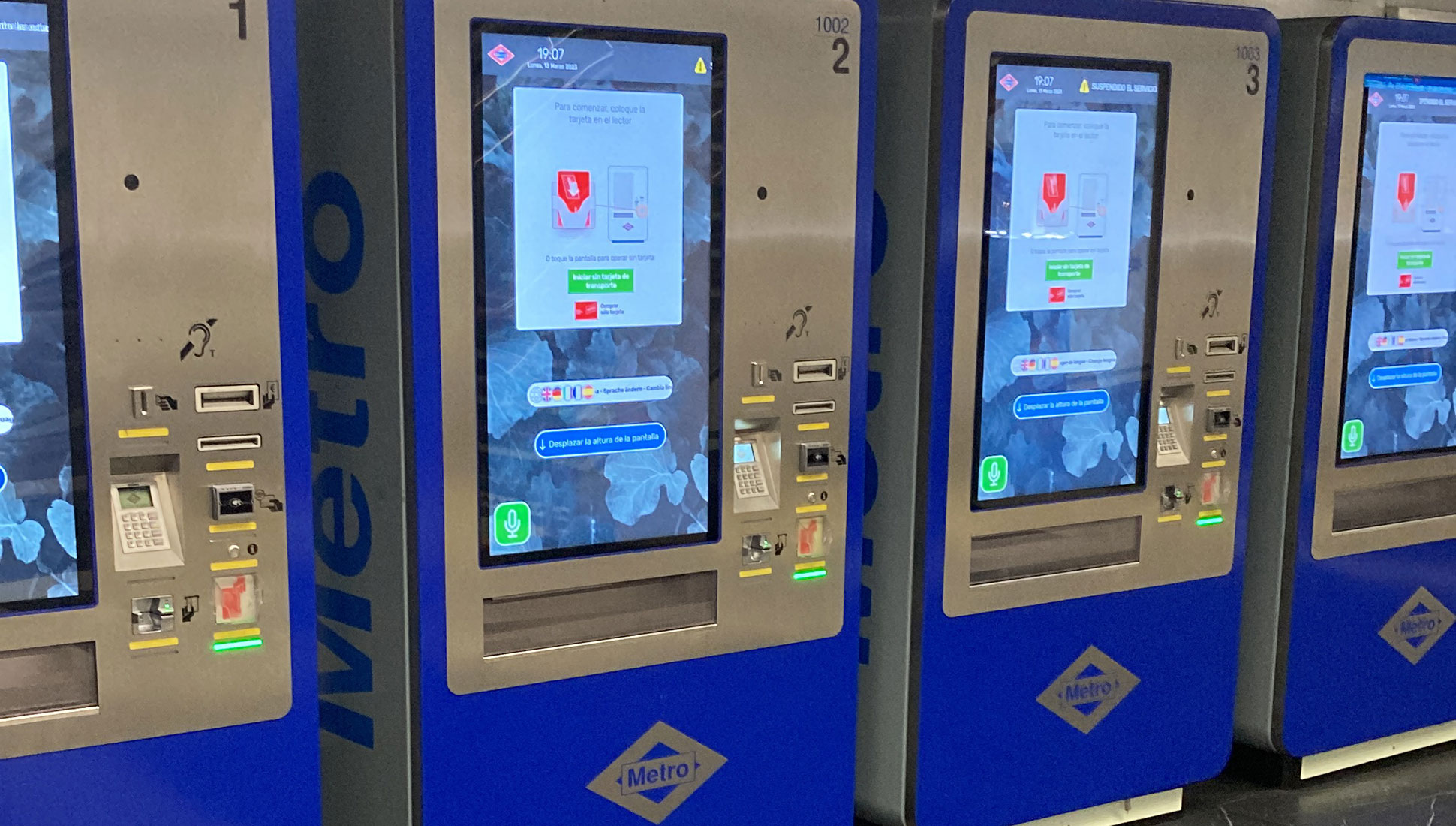
Interacting with businesses through screens isn’t new. We’ve been doing it for a while—from managing transactions at an ATM, introduced in the 1970s, to buying a metro ticket from a vending machine. So, what’s changed? Well, firstly, the type of screen. Screens now are of higher definition, larger, and above all, touch-enabled. This brings us to the next significant change, the communication logic we’ve learned from mobile phones and tablets. Gestures like tap, double tap, long press, swipe, flick, pinch, spread, scroll, or drag and metaphors like the hamburger menu or tabbed navigation can now be used in digital kiosk interfaces without confusing users.
Therefore, the success or failure of a digital kiosk is significantly determined by the design of its user interface. If interacting with them isn’t straightforward, quick, and satisfying, people will prefer manned counters, and the kiosks will be overlooked. This is where web design studios come into play, leveraging their UX/UI experience in developing these interfaces.
However, even with similarities, designing an interface for the web vs. a digital kiosk differs in some aspects. Let’s go over a few.
Navigation in digital kiosk interface design
A crucial aspect to remember when designing a digital kiosk interface is that users might not be familiar with its use. Given their placement in public spaces, users don’t have a learning curve. Usability issues can be fatal, causing user frustration, especially if others are waiting behind them. To reduce potential errors, simplicity and intuition play a critical role in a digital kiosk’s user interface, even more so than on a website.
Hence, first and foremost, the kiosk should explain its functionality at a glance. Then, the best approach is to use linear navigation, ensuring a singular focus per screen, and leveraging what users have already learned from their mobile app interactions.
Thanks to this navigation design, digital kiosks create more uniform processes, ensuring all users go through the necessary steps identified beforehand.
Interface design for digital kiosks
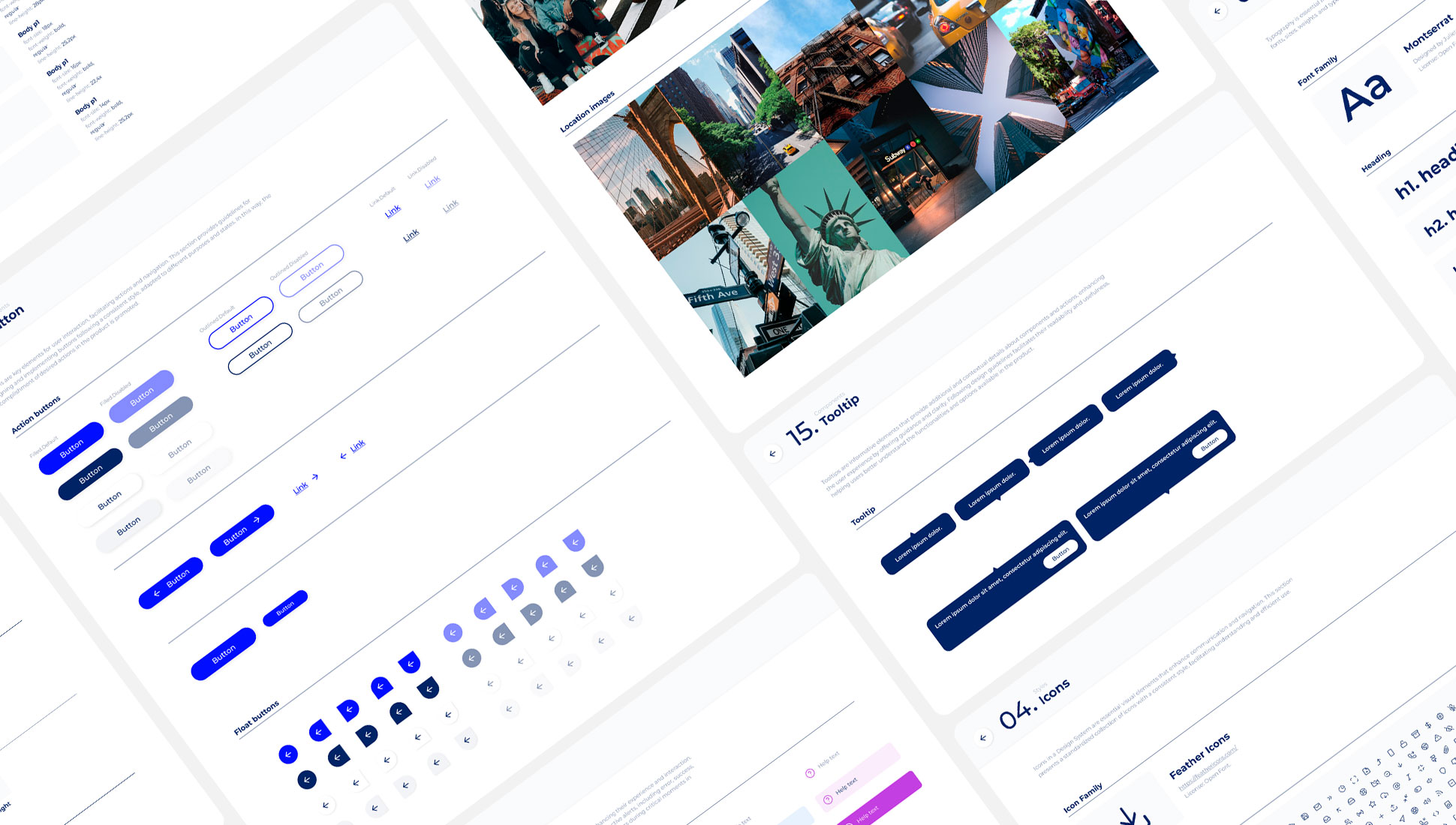
But how do we make a user interface for a digital kiosk easy to use? The first step is to provide it with coherence. And in this sense, in OKB Interactive Studio the first thing we do is to develop a design system, which is the set of elements that we will use to build the various steps of the interface. As we have seen, thanks to previous learning on mobiles and tablets, interacting with screens is now much more familiar to us, so we can incorporate the same elements that we currently use on a site: buttons, forms, tooltips, tabs, carousels… These elements will help us to make the interface more understandable and easier to use, because clear and recognizable patterns are created: colors always mean the same thing, two same elements will always have the same behavior, the same action is always performed in the same way in the different phases… If an interface is consistent it will be predictable. And if it is predictable it will be easy and fast to use.
After designing and approving the design system with the client, the next step is to draw up the interface navigation diagram:
- Simplify the number of steps: so that interactions with the kiosk do not generate frustration, they must be simple. To achieve this, the number of steps must be reduced. We also try to ensure that each of these steps always occupies the entire screen, to avoid distractions. The user must also be informed of which step they are at and how much time they have left to finish, as well as always being given the possibility of going back to make any changes.
- Identify the needs and fears of users in each of the steps in order to solve them.
- Work the texts: digital kiosks communicate with users mainly through written text, so it is key to pay attention to the writing of clear and precise texts that anyone can understand, and at the same time help the tone to be appropriate to generate a good atmosphere between the user and the service. Technical and alarming language should be avoided.
Finally, once the steps of the digital kiosk interface have been defined, we move on to the design of each one of them.
Physical environment in digital kiosk interface design
Perhaps the first difference between designing a web user interface and a digital kiosk interface is the physical medium. Digital kiosks are designed for a specific location and device, whereas websites can be accessed from anywhere. This difference significantly influences the final interface design.
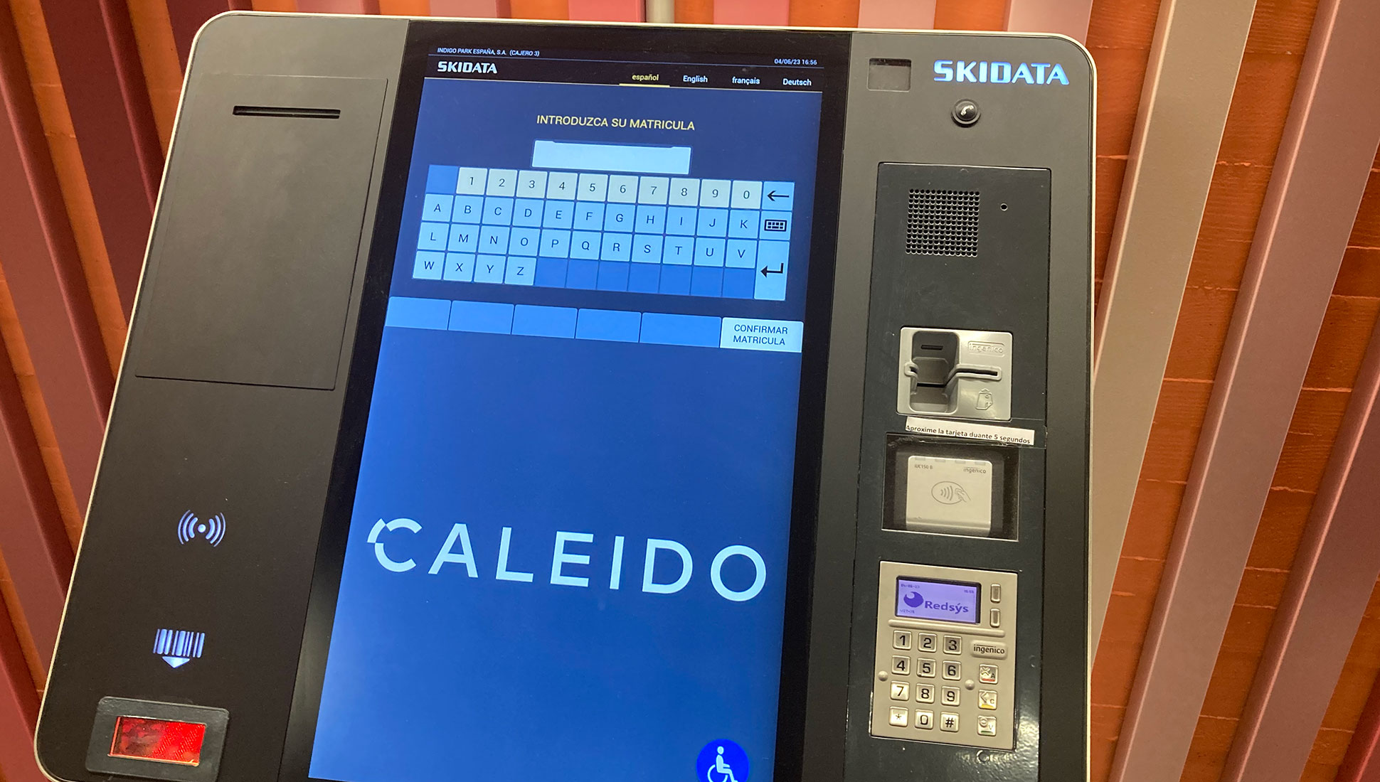
o begin with, those who interact with a digital kiosk do so standing up and at a considerable distance from the screen. This is why it is important to take into account the reach of the arm and that their movements are comfortable (approximately 10% of the population is left-handed). One straightforward but crucial aspect is user height. For instance, in the Netherlands, the average height for adult males and females is 1.84 and 1.70 meters, respectively. In United States, these numbers decrease to 1.77 meters for males and 1.63 for females. But in Peru, they stand at 1.66 and 1.54 meters, respectively. We also need to account for users in wheelchairs. Therefore, when designing interfaces for digital kiosks, navigation elements should be placed in easily accessible areas, neither too low nor too high, avoiding discomfort for some users, and even allowing them the option to move the information to the screen’s lower section if they prefer.
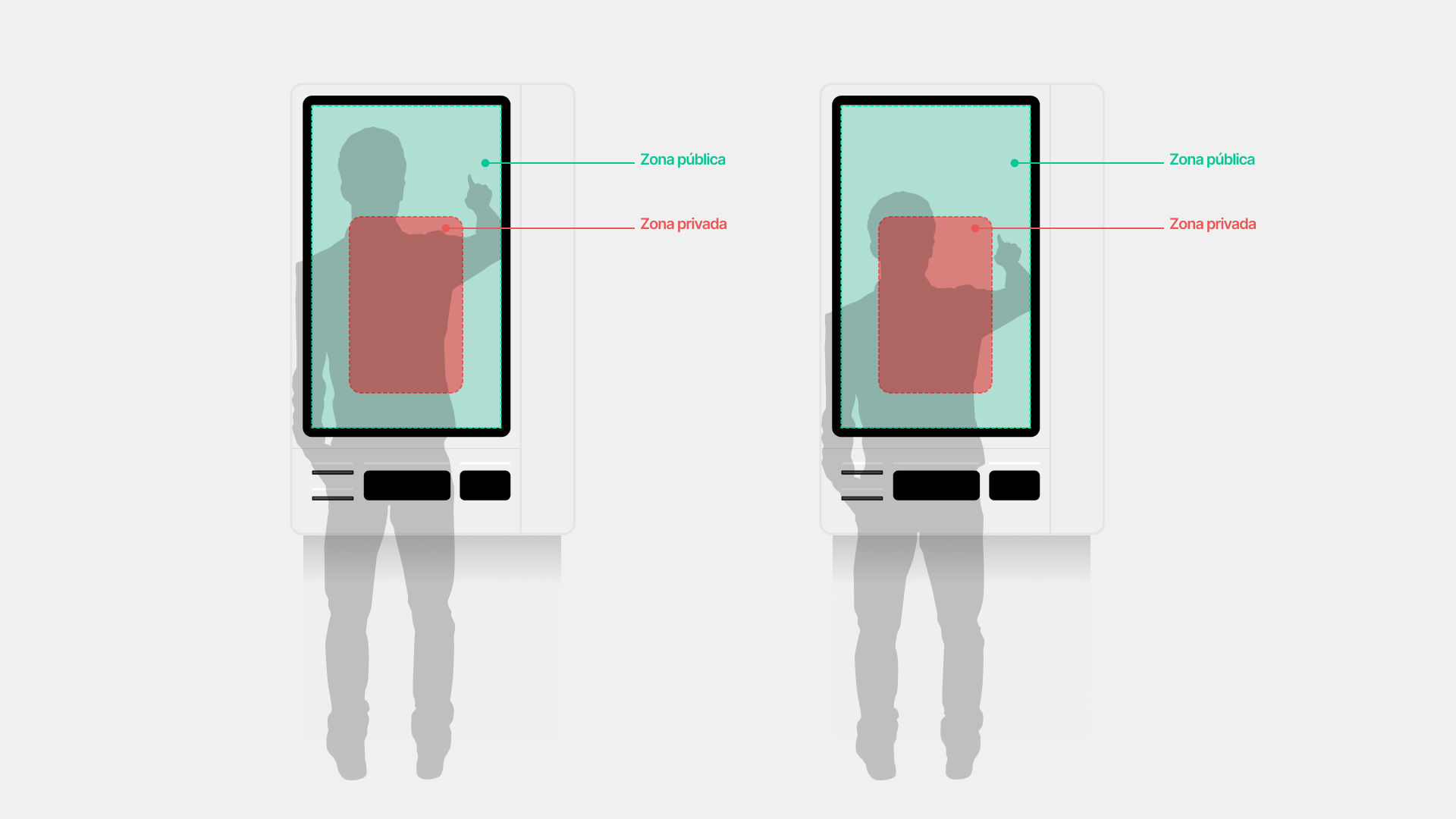
Another environmental factor is privacy. While a website is usually used mainly in private, digital kiosks tend to be in public spaces where there is a high flow of people. Therefore, on the screen of a digital kiosk, you must differentiate between two areas, a private one and a public one. The private area occupies approximately the bottom two-thirds of the screen. It is the most accessible area for most users and is also the part that is covered by the user while interacting with the kiosk. For this reason, the central actions of the process as well as the user’s most intimate information should always be placed in this area. On the other hand, the public area is generally located in the upper third of the screen, in a space that is exposed to the public in most cases while the user interacts with the kiosk. Therefore, sensitive information for the user (such as their phone number, ID, bank balance, card number, etc.) should never be placed here. In addition to being the most exposed area, it is also the least accessible, so only secondary actions and complementary information should be placed here, never central actions of the process.
Finally, noise is another important factor. And we are not only referring to sound noise, but also to ‘visual noise’: digital kiosks can be installed in areas with a multitude of attractions and distractions for the user, so we must also take into account these limitations, designing a much simpler and intuitive journey, which does not require the user’s full attention.
Interfaces for digital kiosks: two in one
Digital kiosks are two things at the same time: they provide services, but they are also an advertising draw. Therefore, while it is not being used by any user, the kiosk must display promotional content on the screen, which attracts the user’s attention and encourages him to use it.
So, the interface should not only be usable but also attractive and with personality. In this sense, having a design studio like OKB Interactive Studio, which not only focuses on the user experience but can also help create attractive and eye-catching content that connects with your users, can be very beneficial to make the most of the opportunities from digital kiosks.
Designing interfaces for digital kiosks beyond the screen
Finally, although we have so far focused on what happens on the screen, we must not forget that many digital kiosks may have other peripheral elements necessary to carry out the function for which they were designed, such as a scanner, a camera, a thermal printer, slots for credit cards or cash… Each part of the digital kiosk with which users are going to interact must be clearly indicated, located in an ideal location based on its usability, and have indicators — usually an LED light — that capture the user’s attention when the action focus moves from the screen to one of them. This way, the user will always know where to scan a document, take a photo, insert bills, or collect a receipt.
In this sense, special attention should also be paid to the external appearance of the kiosk, using vinyls that maintain the same graphic line that has been used in the interface screens. This will not only maintain coherence and cohesion between the application and the physical device, but will also help to make the kiosk more eye-catching and attractive, increasing its interactions.
Benefits of digital kiosks
If you work properly the user experience and design the right interface, digital kiosks have many benefits for your business:
- In our opinion, the main advantage is that you will be able to adapt the service to the users’ consumption tenancies: being present where your users are and interacting with them through their preferred channel will always be positive for your business.
- With digital kiosks you will achieve longer interactions with your customers, which will reduce your abandonment rate and help you get more people to complete their purchase process, even increasing the chances of them buying other products or services through crosselling.
- Digital kiosks can be a very attractive way to present a product.
- You will increase the visibility of your brand and attract more people to the physical space.
- You can offer your service 24 hours a day, without interruption.
- You can collect data from your users (hours of access, navigation mode, ratings…) that are very useful to make improvements in the product.
- If this is one of your needs (for example if your business is located in a place with a large number of foreigners), you can offer your service in a multitude of languages in a simple way.
As we have already seen, digital kiosks can be adapted to a multitude of services: restaurants, health care, ticket sales, information stands, hotel check-ins, currency exchange… And yours? Do you think a digital kiosk could be useful for your company?
If so, you will need the interface design to meet very specific needs. This is where OKB Interactive Studio can help, offering fully tailored solutions for your business, your goals, and your customers.
Did you find this post interesting? Share it!
Your contacts will like to read it, for sure!


