Insights
How to choose your web color palette
Did you know that in the early days of the Internet, websites were built based on a palette of only 256 colors? Today most devices can reproduce a very wide range of colors, so when it comes to choosing the color palette of a site designers are faced with a task that covers about 16 million possibilities. How to choose the perfect colors and especially how to combine them harmoniously with each other? This is what we are going to talk about in this article.

Okb Interactive Studio
Do you need a corporate website that stands out for its innovation and design?But why is color so important? Color (as typography as well) is a language, so it can communicate by itself. Colors have a strong emotional impact on the way we perceive things, which makes them a powerful design tool. Therefore, by carefully selecting the colors we are going to use on a website, we can reinforce the message we want to convey for our own benefit.
Color Psychology
Each person has their own experiences with colors. Some we like more and others less. But throughout history, colors have been intensely associated with different realities, which culturally has made our brain evoke certain sensations when perceiving a color. This is what we call color psychology.
Let’s propose a little game. If we ask you to think about a pharmacy, what color is the first that comes to your mind? And if you had to assign a color to the police, which one would you give? And for a firefighter? Now imagine a gym. What color would be the predominant one there?
Although it is true that colors can evoke one thing or another depending on their hue (if it is lighter or darker or if it is more or less saturated) and the combination with other colors, as a summary we can say that…
-
The different types of red always increase our adrenaline level, call us to action and convey strength, power, and relevance. Red is designed to awaken our primitive instincts, so it always gets our attention, don’t forget it’s the color of danger. Surely it is the color that came to mind when we asked you to think about a firefighter…
-
For many the ‘little brother’ of red, the orange is a powerful color and hard to miss, but less aggressive. Its warmth is used to evoke a fun atmosphere. In fact, some brands use it to convey friendliness, simplicity, closeness, and low prices.
-
Yellow is associated with the sun and everything it represents: warmth, energy, joy. It is the most visible color in the chromatic spectrum, so it is especially striking. It is also activating: don’t you think that a gym where yellow is the dominant color calls more to be active?
-
Being the color of nature, green conveys a sense of health, cleanliness, and purity. That’s why it’s ideal for organic, eco-friendly, and healthy products. Is green the color you thought of for your pharmacy?
-
Blue is the opposite of red: it conveys security, serenity, tranquility, solidity, trust… These are values highly desired by any company, so it is not surprising that it is one of the colors most used by brands, especially banks and insurers. We are also convinced that it is the color you thought of when we talked about the police, right?
-
Since time immemorial, purple has been associated with power and wealth, making it an ideal shade for luxury brands. It is also the color of magic and mystery.
-
White is synonymous with purity. On the web, it is often applied to backgrounds to give a sense of cleanliness, freshness, and simplicity.
-
Black has that mysterious and unknown point that attracts humans so much. It is also the color of elegance and luxury.
How to combine colors in a palette?
Once the meaning of each color is known, it’s time for the difficult task of pairing colors to create color palettes. To combine colors in a color palette, color wheels are usually used, which usually contain 12 colors, each representing a family of hues. These colors are red, vermilion, orange, ochre, yellow, lime, green, cyan, blue, purple, violet, and garnet. Here is an example:
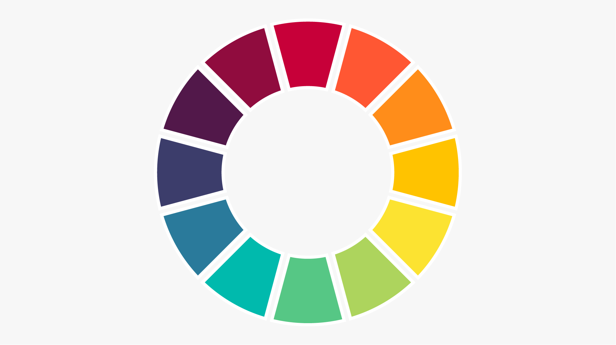
In these color wheels, there are three colors we call ‘primary’: they are red, yellow, and blue. On the other hand, the colors that are located between these colors (orange, green, and violet) are called ‘secondary’. Finally, the rest of the colors are considered ‘tertiary’.
In this article, we will look at five ways to combine colors to create harmonious color palettes for a web using color wheels. They are the monochromatic combination, the analogous combination, the combination of quarters, the combination of thirds, and the complementary combination.
The monochromatic combination is actually not a combination in the strict sense, as it consists of using the same hue and playing with the saturation and luminosity to generate the remaining colors of the palette. The color palettes that resort to this type of combination are very consistent and discreet, but they are also more limited and, therefore, more difficult to work with.

On the other hand, if we combine two colors that are located next to each other on the color wheel, we will get an analogous combination. Due to their tonal similarity, this type of combination is usually discreet and elegant.
You can also combine a color with the closest non-consecutive color on the color circle. It’s a slight variation of the analogous combination, also known as quarter combination. The contrast is greater, but the resulting palette is still in the same ‘temperature’, as we see in the following example:

If we want to take more risks with our color palette, we can try to pair a color with the one that is 120º from it on the color circle (that is, a third of the circle, hence it is generally called a triadic combination). The result is undoubtedly more striking.

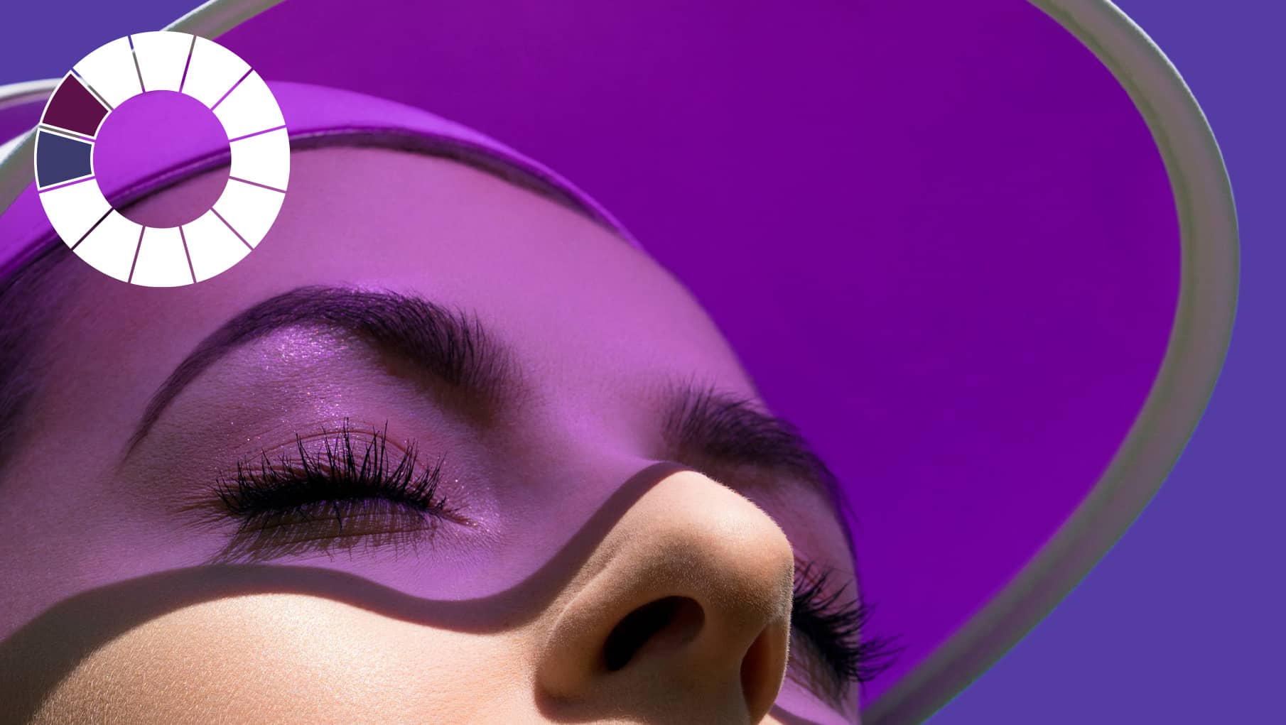
Finally, we have the complementary combination, which is based on combining a color with its opposite on the color wheel. Since the two colors are very different, the effect achieved using this combination is very striking. Look at the image below, for example, where the orange has been combined with indigo, creating a very powerful image:

When generating color palettes for a website, it is very important that all colors maintain a certain harmony between them in brightness and saturation to make them seem like a family.
This tone is very important not only as a unifying element but also as a message transmitter. For example, if the colors of the palette tend to a pastel tone, a more relaxed atmosphere will be created. On the contrary, if the palette acquires a more fluorescent tone, it will automatically become more daring and bold. This should be taken into account to suit the profile of our ideal user.
How Many Colors Should Be Included in a Palette?
To improve the consistency of a site, it is advisable to use the least amount of colors possible. However, having a very limited palette will generate difficulties. It is advisable to always include:
-
Brand color: Or corporate color. It is the color that represents us as a brand. We can also call it the primary color, as it is the one that occupies the most space within the site and the one that will be taken as a starting point to generate the rest of the palette.
-
Emphasis color: This is usually a very striking color that offers good contrast with the dominant color. Its function is to draw users’ attention to some strategic elements, such as buttons, links, or some texts. A trick is often to use the complementary color of the brand color (that is, the opposite color of the color circle) as the emphasis color. The use of the emphasis color should be done in moderation, as using it too often will make it lose the effectiveness for which it is intended.
-
Secondary colors: Maintaining a website with only brand colors is not easy. That’s why it’s logical to add a few additional colors to the color palette (it’s common to limit to two or three secondary colors and try to hierarchize them among themselves). To select these colors, you can use, for example, the analogous colors of the main color or choose the two most equidistant colors from the corporate color (triadic composition).
-
Neutral colors: These are the colors used in the architecture of the site, such as some backgrounds, lines, and texts. These colors are usually white and black, with some intermediate gray added.
-
Functional colors: Finally, a color palette should include colors that serve to represent actions, such as errors (usually red), warnings (yellow), confirmations (green), or information (blue). These colors should also be harmonized with the rest of the colors in the color palette.
Once all your colors have been selected, you should include variations of all of them by modifying their brightness. Generally, four variations of each color are included (‘dark’, ‘main’, ‘light’ and ‘faded’). These variations are very useful, for example, when creating hover effects, gradients, or indicating that an element is disabled. At this point, it will be very useful for you to work with HSL color models (from hue, saturation, and lightness).
Color defines our personality and represents us as a brand. Choosing the right colors can sometimes be the factor that determines the success or failure of a website. The first impression that users have greatly determines their relationship with a website, so if the color palette does not convey the values and emotions they expect to find or does not make them feel comfortable, they will abandon the site without the message having resonated with them.
Experimenting with different color combinations until finding the perfect result is one of the most difficult but also most fun tasks for a web designer. And if you need a little help, the internet is full of many free online tools that can assist you, such as Happy Hues, Colourcode or Coolors, among many others.
Did you find this post interesting? Share it!
Your contacts will like to read it, for sure!


