Insights
Tips to improve readability in your web texts
If you want your website to retain your visitors, you have to pay attention to every detail. And one of the most important details is undoubtedly the typography you choose for your texts. Typography is the basis of the text, the text is the container of your message, and your message is the raison d’être of your site. Therefore, a well-chosen typography can enrich your website by making your texts more comfortable, easy and attractive to read, while a poor typography can interfere with how your users receive the information, even in the worst case scenario, causing them to leave your page. But when we talk about ‘typography’, we’re not just referring to a type of font: there are many other factors that influence the readability of a text such as size, line spacing or color, which we will also analyze in this article.
It is true that not all websites are the same, or (to be more precise) not all web pages of the same site are the same. There are pages where the user mainly interacts: their attention goes from one side to the other, focusing on some elements but overlooking others. Here images and graphic elements have more prominence while the texts are usually scattered throughout the page, but in small quantities. And most are not read carefully.
On the contrary, on other web pages, text is the central element, as is the case for example with blog articles or news from a digital newspaper. It is on these types of pages that we are going to focus. On them users mainly read, as the text contains almost all the relevant information. So if you make sure the texts are legible, you will provide a better experience for your users.
The first thing to be clear about is that the typography of your web texts does not necessarily have to be your corporate font. What is really important to achieve brand consistency is not to use the same font on all supports, but to use a specific font for each context and that performs its function well. In this way, the same brand can have a corporate typography for printed material and another for online communications.
What is the best font for web?
The first step to improve the readability of your website texts is to select an appropriate typography. At OKB Interactive Studio, we usually work with two typographic catalogs: Google Fonts (free) and Adobe Fonts (paid). Just between these two catalogs, the range of fonts is almost infinite, which instead of making the choice easier often poses a problem. How to choose the best font for your website among so much offer?. Let’s go step by step…
‘Serif’ or ‘Sans Serif’, that is the question…
As we see, there are thousands of typefaces, but when it comes to it, the first big decision is only between two options: serif typefaces (such as Georgia) or sans-serif typefaces (such as Inter).
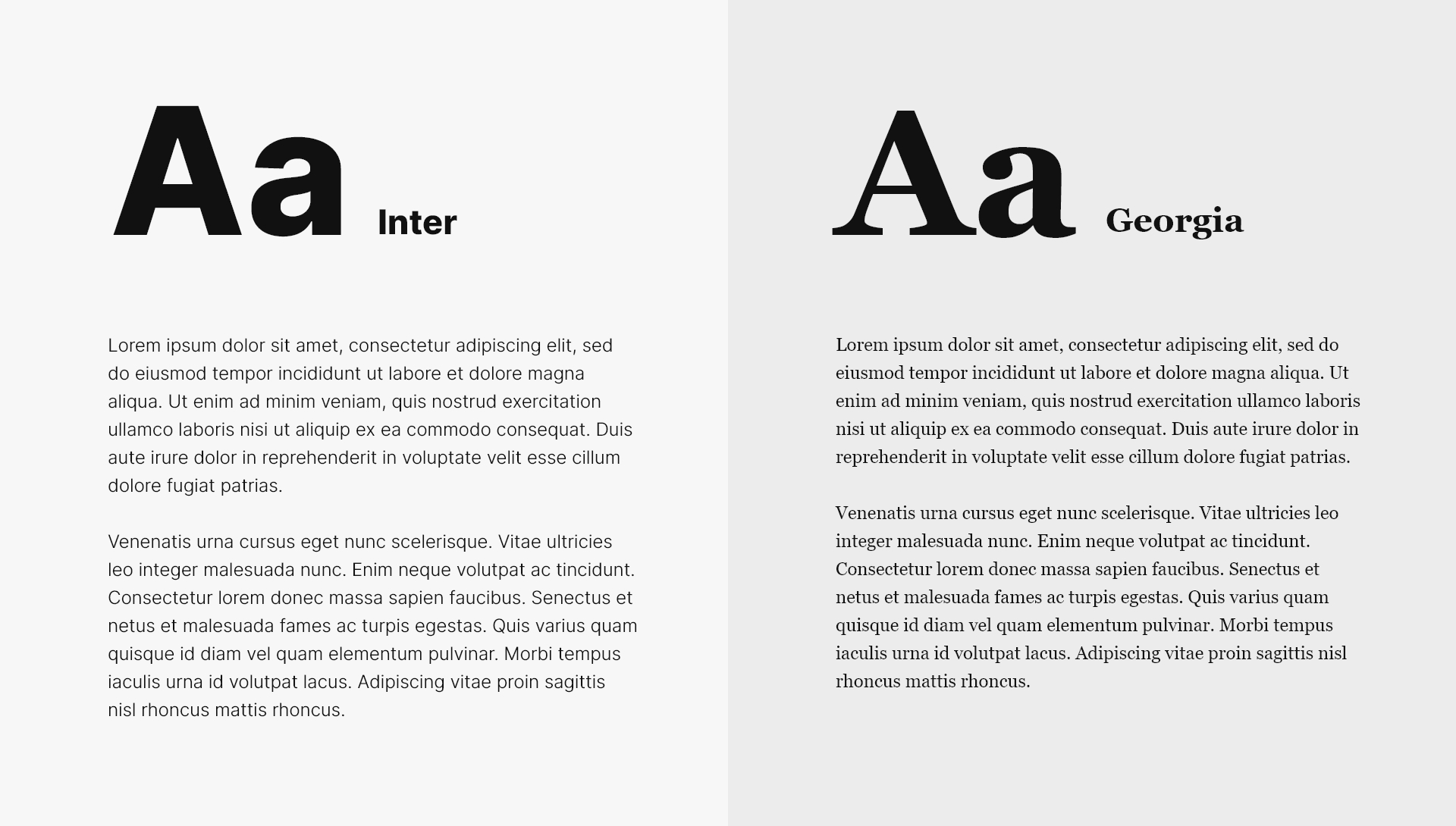
Which ones are better? Here there are opinions for all tastes. Generally, it is often said that for general texts with reduced sizes, the serifs of the serif typefaces help visually connect the letters and create more harmonious ‘grays’ (we call ‘grays’ the visual ‘stain’ formed by dense texts). Other studies —tested even with people with dyslexia— however, argue that the typefaces that most benefit reading are the sans-serif typefaces.
Be that as it may, the truth is that traditionally on the web, sans-serif typefaces have always been used more. The reason is that in the dawn of the Internet in the nineties, monitors were not of great quality and therefore the simple shapes of sans-serif typefaces better fit the pixel grid of screens, where the serifs of the serif typefaces blurred texts. But in the current situation, with most users peeking at the Internet through high-resolution screens, serif typefaces can be represented with the same sharpness as on paper, so there is no reason to limit the choice of your font to a sans-serif typeface. In fact, more and more blogs use serif typefaces. So is your choice.
On the other hand, as happens with people, fonts have personality and —although this does not directly influence readability— the truth is that matching the personality of your typography with the tone of your message will help your texts be better understood. Serif typefaces are often associated with more serious texts and a more classic audience, while sans-serif typefaces have a more modern and relaxed feel.
How to know if a font is readable?
Not all types of letters are designed to be readable. There are some typefaces with strong personality that are designed to attract the reader’s attention and convey a mood in line with the message. You can use these typefaces for short texts and with larger bodies, such as in titles, but not for general texts.
For example, excessively geometric typefaces greatly simplify their strokes so that the characters look very similar to each other. Look at the following examples:
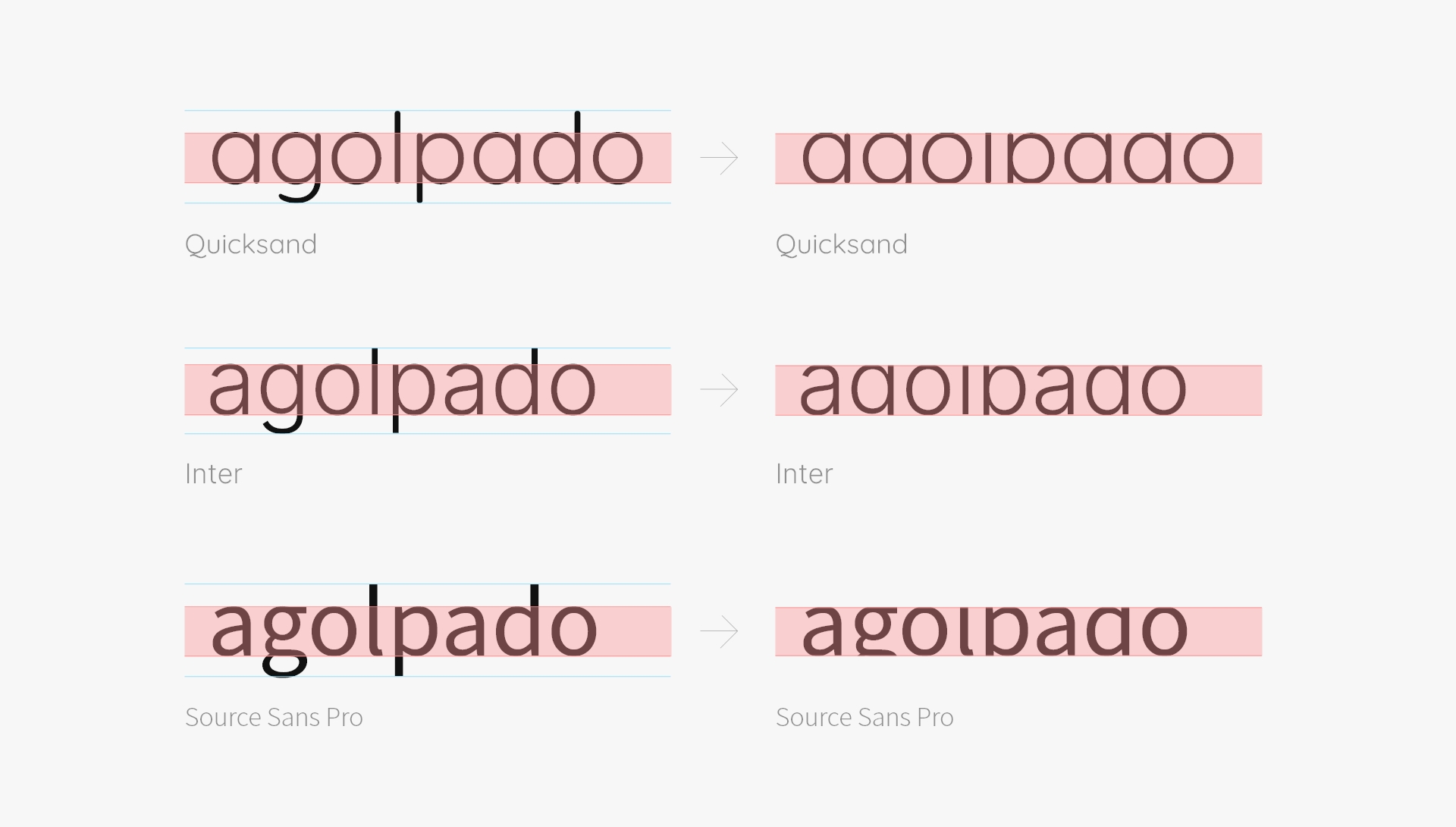
If we focus on the central part of the word ‘agolpado’ (‘clustered’) in the first example —for which we have used Quicksand— almost all the letters have the same shape, which makes correct reading difficult. In the second example —written with Inter— the word begins to differentiate better, thanks mainly to the letter ‘a’. Finally, in the third example —which uses Source Sans Pro— the ‘g’ and the ‘l’ give the text even greater readability.
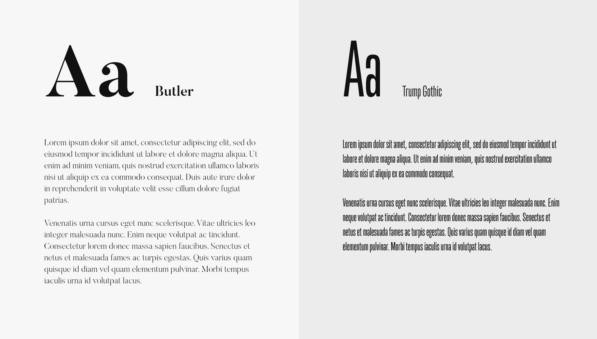
Similarly, condensed typefaces (like Trump Gothic) are less readable, so they should never be used for general texts. Their function is to reduce white spaces in a composition, so they should be used in short texts, like titles. The same happens with typefaces with a strong stroke contrast (like Butler), which can be very elegant but hard to read in long texts with small bodies.
Our advice is always to choose a typeface that reads very well, even at very reduced sizes. There are highly readable typefaces, some even specifically designed to facilitate reading for people with dyslexia, something you must take into account if your audience is very broad or if, for example, you do work for public agency, such as a city council or a non-governmental organizations.
What stroke is most appropriate for a font?
A few years ago, it became very popular among web designers to use very thin fonts in their texts. However, it seems that common sense has prevailed and the trend now is returning to the use of thicker strokes in letters.
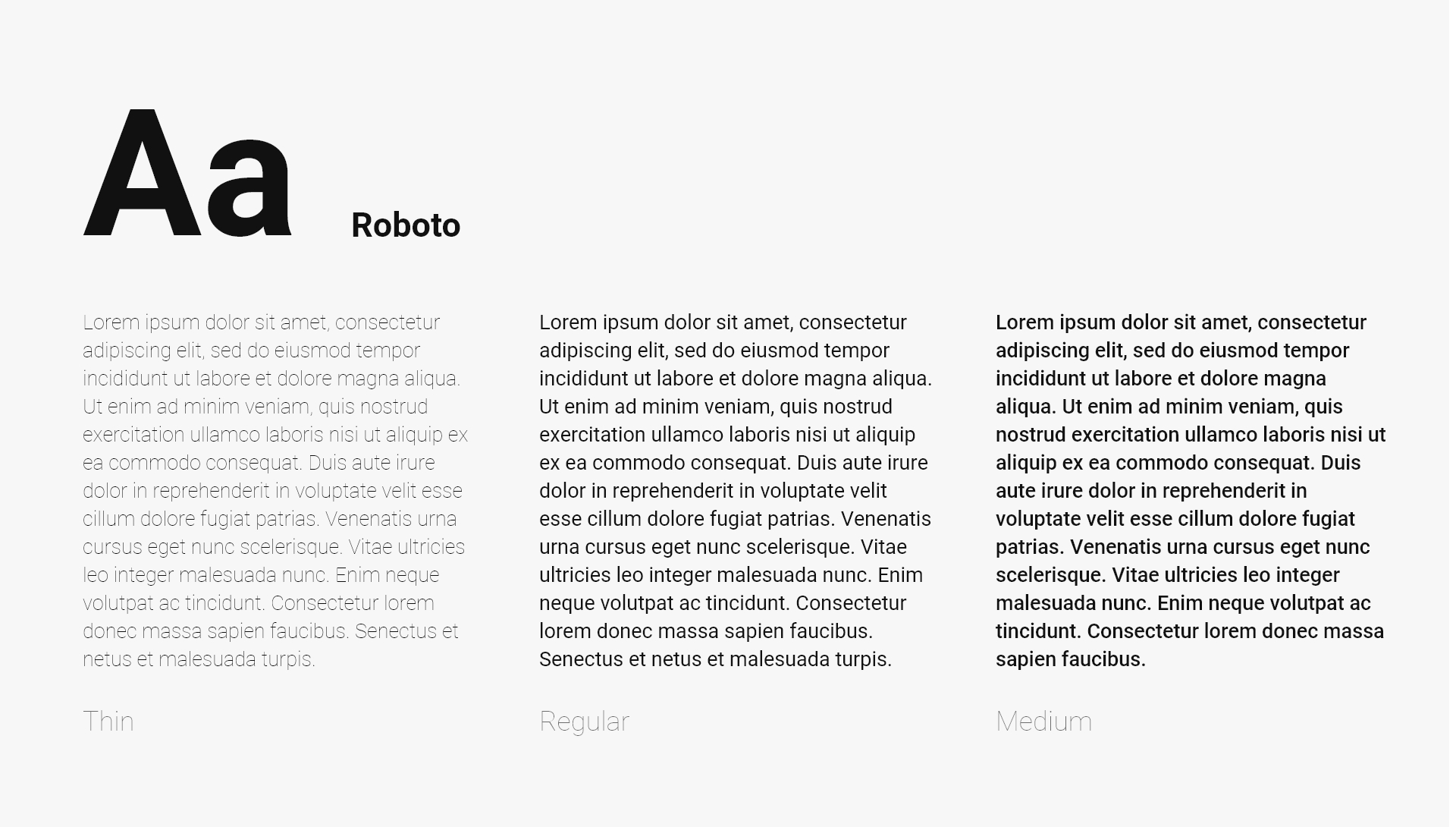
If you use regular or medium weight fonts, you will not only achieve a more uniform ‘grey’ in your compositions, but you will also help your users to have a better experience on your website. Certain visual conditions such as presbyopia prevent clear vision of nearby objects, so very thin letters literally disappear against the background. And this affects many of your users because presbyopia or eye fatigue affect approximately four out of every ten people, but this figure rises to six out of every ten over 40 years.
Mind the performance
When choosing the perfect font for your website, an important aspect to consider is performance. If you want to use fonts, you should know that it implies something: longer loading time. So, if your site’s speed is a very important factor for you or you need to get a very good rating on Page Speed Insights, then it might be interesting to resort to web safe fonts when choosing your website’s typography.
Web Safe Fonts are those fonts that come preinstalled by default on the main operating systems: Arial, Tahoma, Trebuchet, Verdana, Georgia, Times New Roman… As not all operating systems have the same fonts installed (for example, Helvetica is very common in Mac environments but less common in Windows) it is usually common to use what is known as a ‘font stack’, where several similar-looking fonts are chained together in order of preference so that each user uses the first one their operating system can support.
What is the appropriate font size for a web?
Now that you have chosen your typography, the second dilemma comes with its size. 16 pixels is the size that is traditionally applied to general texts for the web. In fact, it is the default size used by most browsers. However, not all fonts have the same size, so two different fonts can be more or less legible even though both are at 16 pixels.
This is because by ‘font size’ we understand the space that goes from the upper end of the ascending strokes of some letters (‘t’, ‘d’, ‘f’, ‘h’, ‘k’, ‘l’, ‘b’) to the lower end of the descending strokes of others (‘q’, ‘y’, ‘p’, ‘g’, ‘j’). However, as we have already seen, the most important part of a font is the central part, also called ‘x-height’ because it corresponds to the height of the letter ‘x’.
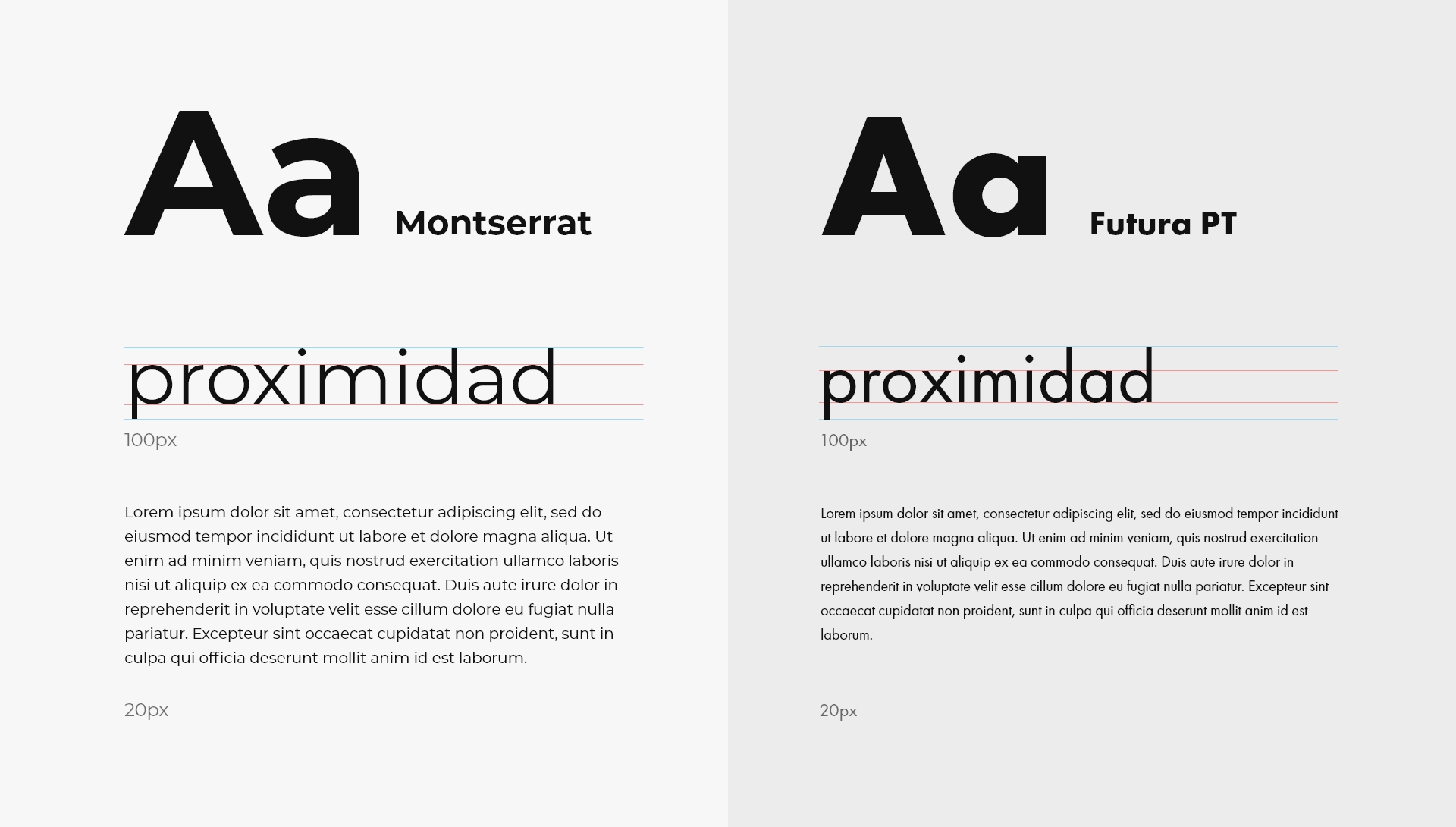
In the above example, we see how some fonts with very pronounced strokes (like Futura PT) visually seem smaller than others with shorter strokes (like Montserrat). At 100 pixels in size, the ‘x-height’ of Futura is 44 pixels, while in Monserrat, at the same size, it is 56 pixels. So, size is relative.
Using too many font sizes in texts can ruin a website. Try to limit yourself to a specific typographic scale.
Fonts with an ‘x-height’ greater than 50% of their size are more legible than fonts with very pronounced ascenders and descenders, so as a general rule we recommend choosing fonts with a large ‘x-height’. In these types of fonts, the texts on your website should not go below 16 pixels, although our recommendation is that, once you have chosen your font, you test them at 18 pixels. You can even apply a size larger than 18 pixels: it may seem strange at first, but sometimes it works. In fact, some reference websites, such as WePresent or Medium, use sizes of 20 and 21 pixels respectively for the texts of their articles. And they work wonderfully.
However, these recommendations are only valid for desktop screens, where the distance between the eyes and the text is high (some labor regulations state that the screen should be placed at a distance of more than 50 centimeters from the user). Mobile devices, on the other hand, are used at much less distance (about 25 or 30 centimeters) and also have a narrower screen width, so the font size should be reduced, specifically around 20% and provided it does not go below 15 pixels for very legible fonts (with a large ‘x-height’) or you will condemn your users to strain their eyes (if they don’t leave your website first…)
Finally, we advise you that the optimal way to choose the size of fonts for mobile is to view the designs on a real device. The feeling of checking a mobile design on a computer screen is always completely different from when it is actually viewed on a phone. Currently, many UI tools like Figma, Adobe XD or Sketch already offer the possibility of viewing designs on a mobile. Use them!
How many characters should have a line?
If we talk about font size, we have to talk about another decisive factor directly related to size: line length. Or in other words: the number of characters that fit in each line of a paragraph.
Very short lines are very tiring to read because they require the eyes to constantly move back and forth, while very long lines make it difficult to follow the text each time the view has to move from the end of one line to the beginning of the next one. So, achieving the perfect balance is key. The optimal line length contains approximately 80 characters for wide resolutions (desktop) and about 40 or 45 for mobile devices.
What line height should be left in paragraphs?
When we talk about line height, we refer to the vertical space between two lines of the same paragraph. Specifically, the space between the base of one line and the base of the immediately following line. Traditionally in printed texts, it has always been common to use a line height equivalent to 120% of the body of the typography being used. Thus, if a 12-point font was used, the leading was usually set at 14.4.
However, in digital environments, the value of the line height usually rises to 145% or 155%. Even some sites use 160% (like the news on the website of USA Today, the largest circulation newspaper in the United States). Once again, the final decision depends on the chosen typography:
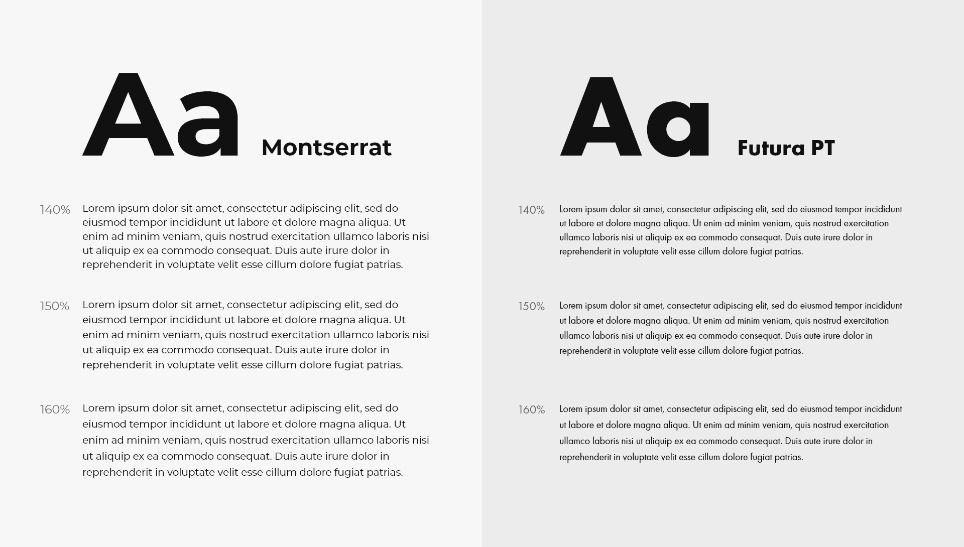
As you can see in the example above, fonts with very small ‘x-heights’ (like Futura PT) give a feeling of more separation between lines, so they work better with smaller line spacings (140% would be fine in this case). However, fonts with larger ‘x-heights’ need larger line spacings to improve their legibility (in the case of Montserrat, 150% seems to work better).
Similarly, the line spacing should be increased if very small font sizes are used, as the texts are more difficult to read and therefore need more space to be able to follow them easily. So perhaps it’s also necessary to use one line spacing for large resolutions and adjust it for small ones as the font size is reduced.
How should text be aligned on a website?
Well, there is no doubt here: always aligned to the left. Justified text may seem more harmonious, but it really complicates reading because to adjust the line length it increases the separation between words, thus generating the so-called ‘typographic rivers’ (large white spaces that make it difficult to follow the line and distract attention from reading).
So why do we justify texts in books, magazines, or newspapers? Because in these media, designers work on fixed dimensions and can fix these ‘rivers’ with tracking and word splitting. On the other hand, on websites, the text is fluid and the designer does not know exactly how this text will reach the user or what line length it will have: it can appear on a 2,500-pixel-wide monitor or on a mobile device of only 360.
What is the best color for your texts?
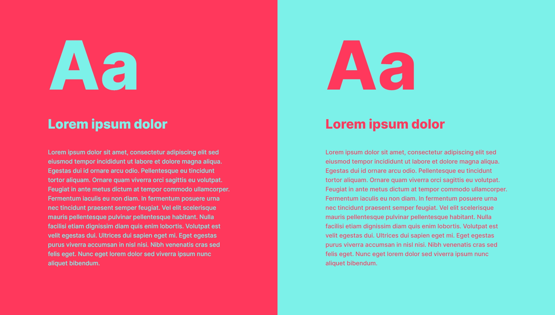
Choosing the perfect color for the texts on your website is an important detail, as color is a language in itself that will directly affect how your users feel when they read your content. So our advice is to use color to achieve the mood you need in your readers depending on what you want to tell them. And above all, ensure that the message and color do not contradict each other. Red, for example, is a color that generally puts us on alert, so it is not very advisable for the reading texts of your site, because your readers will find it very tiring.
However, when it comes to improving readability, the contrast that the color offers against the background on which it is represented is more important than the color itself. If you use very similar colors in your texts and in the background, your message will not be transmitted effectively. The same happens if you use texts with cold colors on backgrounds with warm colors, because they ‘contract’ creating an effect similar to sinking into the background.
At this point, you also have to keep in mind that many of your users will have some visibility problem —which can range from presbyopia to color blindness—, so what for you looks fine may be complicated to read for others. To ensure that the texts on your pages offer a good contrast that improves their readability, it is advisable to verify that they comply with the WCAG guidelines (Web Content Accessibility Guidelines). There are some very useful tools, like Color Contrast or Colorable that will help you with this.
Avoid as much as possible overlaying reading text over irregular backgrounds (such as patterns or images) as this makes reading much more difficult.
Our recommendation is to use very neutral colors for your texts because they will be more comfortable to read. Black text on a white background is the classic that always works well because it is more familiar to users (because it is the most common and inherited from printed texts, which generally use black ink on white paper). However, never use pure black (#000000), as the high contrast with the white background can cause visual fatigue and is particularly annoying for people with dyslexia, who see how the text ‘moves’ and becomes blurry. For example, Google’s Material Design recommends using black #212121. Light but not pure white backgrounds (#FFFFFF) are also more relaxing because they emit less light.
Other considerations to improve readability
-
Never write words only in uppercase, and even less so entire paragraphs. Although it is generally thought that uppercase letters are used to draw attention to something, the truth is that texts written in uppercase are harder to read.
-
If what you want is to draw attention to a part of a text, then the appropriate thing is to use bold. However: bolds emphasize but as a counterpoint they are very heavy and spoil the ‘gray’ of your paragraphs. Do not highlight many words in a row and especially use them sparingly because if almost everything is emphasized with bold then you simply have not emphasized anything.
-
Like bolds, italics should be used sparingly because they also break the ‘gray’ of the composition. In addition, sans-serif typefaces often have horrible italics, so it’s better not to use them much.
-
You should also not abuse underlined texts, not only because they will also spoil the ‘gray’ of your composition but also because any user who sees an underlined text will try to click on it. So limit underlines only to links.
-
All text should always be the same color. The only texts that should be in a different color are the links.
-
To achieve an attractive ‘gray’ make sure your paragraphs do not have too many lines.
-
Try to have your pages contain the fewest possible different typefaces.
Do you still think that choosing a typeface is not relevant for your site? As we have seen, having readable texts on your web will increase your website’s accessibility. And that is good for many reasons: your message will reach more people, your users will feel more comfortable and will have a better opinion about you, you will manage to considerably reduce your bounce rate (improving your SEO) and finally, you will contribute to making the Internet a space for everyone.
Did you find this post interesting? Share it!
Your contacts will like to read it, for sure!


