Insights
How to design an email template for your company
If you manage your company’s email marketing communications, you’ll know that sometimes campaigns can be prepared well in advance. But not always. Last-minute requests and urgent shipments can be more or less frequent, but always sufficiently annoying as to challenge even the most experienced marketer. In these cases, if you don’t have a very solid and versatile custom email template, quality and consistency are often the first casualties in your communications. And that’s something a brand can’t afford.

The email templates offered by most ESPs (like Pardot or MailChimp) are not an option: they only offer some basic customization options, so your shipments end up looking flat, neither representing the visual identity of your brand nor allowing you to stand out among your competitors. Just think about how many emails you open a week and how many really catch your attention. Differentiating your emails from the rest is fundamental and this can only be achieved with an original ad hoc template that unequivocally represents your brand.
Moreover, with a template you will ensure that the user experience when receiving your emails is consistent, among them and with the rest of your brand’s touch points, such as the website, online store, social networks, signage… This is especially useful if the sending of emails is done by several members of the same team. And even more so if different departments are sending emails to the same client database of a company.
In this blog, we have previously talked about , but now we are going to focus on designing step by step an email template that allows us to improve our communications with users. We are going to do it using Figma as a design tool, although in our studio we also often work with other tools such as Sketch or Adobe XD. Later, in another article in this blog, we will see how to layout this template in HTML so that it is compatible with any device —computers and mobile phones— and with the main email clients, including the dreaded Outlook. Let’s get started!
Types of email templates
Before starting to design, one must ask oneself how many email templates we are going to have. What is the right number? It depends on each business, but always few. The fewer you have, the more consistent your message will be and, above all, the easier they will be to handle, maintain, update, and improve. It is advisable to have as many templates as there are types of emails in our company. All of them will keep a series of common elements that will give uniformity to all communications through this channel, but each one will only include the blocks that are most useful to fulfill its purpose.
In general, we could distinguish three types: transactional emails, marketing emails, and newsletters.
-
Transactional emails: These are the emails that are sent after the user has performed some action, such as buying a product in an online store or requesting information in a contact form. These emails are important, as they serve to give the user assurance that the process has been completed correctly. These shipments are usually launched automatically, which is why they are also known as trigger emails in some places. Their open rate is higher compared to other types of emails, reaching more than 50%, so they can be used as ‘Trojan horses’ by including promotional content in them.
-
Marketing emails: These are the emails that are sent to our contact list to inform about an offer or the launch of a new product. Their purpose is purely commercial, so what they are looking for is that those who open them click on one of their links to access a website where it is expected that they perform a specific action, such as buying something in the online store. Their shipment is usually adjusted to the company’s commercial campaigns: sales, new seasons, offers, promotions…
-
Newsletters: Sometimes the role of email is not to sell a product, but to create bonds between brands and their customers. This is what is known as inbound marketing, which consists of creating quality, relevant, and useful content in order to attract our customers’ attention and improve their perception of us. For this, email newsletters are a very useful communication tool. They are sent to those users who have previously subscribed to a list and are sent at a fixed frequency: weekly, monthly, quarterly… Their purpose is not so much that recipients do something specific, but simply to remind them with minimally intrusive content that we are still here, so they remember us when they need us.
You can define these types of emails or as many others as you need.
Workspaces
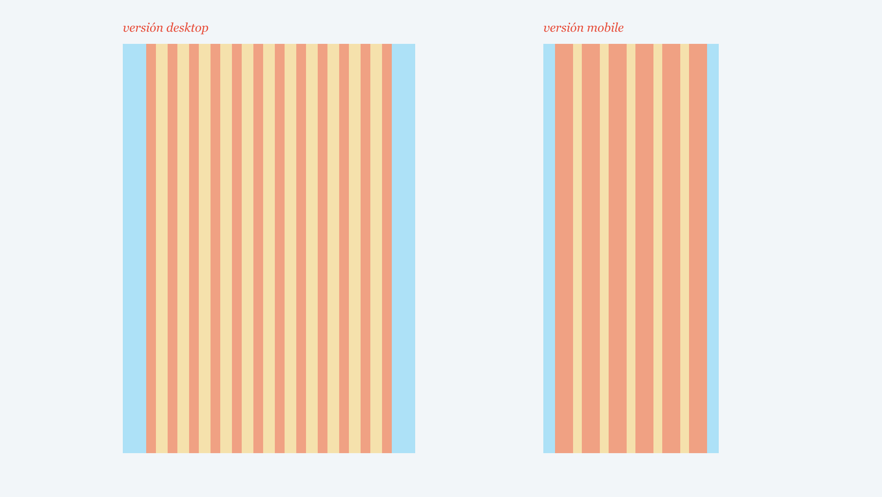
The first step to design a corporate email template is defining the workspaces. In Spain, nearly half of email openings are done through mobile devices. So, if we want our email marketing campaigns to be effective, all the emails we send must have a responsive design that adapts to both large computer monitors and narrow mobile phone screens.
In our studio, whenever we design an email for a client, we create two versions that we usually refer to as mobile and desktop. The breakpoint between these two versions is usually set at 600 pixels: all devices with a screen width below 600 pixels will display the mobile version, while those with a screen width of 600 pixels or higher will show the desktop version.
Versión ‘desktop’
Although it’s called the ‘desktop’ version, it actually applies to monitors, laptops, and tablets. For this design, we usually opt for a fixed width of 600 pixels. Regardless of the screen width, the email will always be displayed at 600 pixels.
The 600 pixels measurement is the approximate standard for designing most emails. This width is considered perfect for emails to be displayed correctly without the content being cut off. It’s essential to consider that email clients (Gmail, Outlook, Yahoo! or Apple Mail) have menus that occupy space on the screen. Combined with the fact that computer screens used to be narrow in the past, the actual display space for emails was reduced to a little over 600 pixels wide. Ever since, this measurement has been used as a reference.
Although there are much larger monitors available nowadays, we still prefer not to exceed much more than 600 pixels as the standard width for the emails we design. This is because laptops are widely used, and it’s common for users to work with floating windows —especially in Mac environments—, this means that the email application is rarely displayed at the full screen width. Additionally, tablets are frequently used to check emails. When using a tablet in landscape orientation, it leaves just a little over 600 pixels of space for displaying emails.
That’s why, in our studio, we always work with designs of 600 pixels width. Sometimes, we go up to 642 pixels, but not more than that.
‘Mobile’ Version
Unlike the desktop version, the design of the mobile version is flexible, meaning it adjusts to the screen boundaries. Although the range that this design covers theoretically goes from 0 to 599 pixels, the truth is that virtually 100% of mobile phones in Spain have a screen width that falls between 360 pixels as a minimum and 414 pixels on the widest devices. For our design in Figma, we will work with a template of 360 pixels. Just like in the desktop version, we always prefer to work with multiples of 6 (we’ll see why in the next point).
The ‘layout’
Once we have created our two workspaces in Figma, we will continue defining the layout. The layout is the way in which we structure the available space in the email so that all elements fit harmoniously within it. Maintaining the same layout in each and every email we send will help preserve the consistency of our communications. It is true that the layout itself will go unnoticed by most recipients, but what they will perceive is the harmony.
In the layout, we distinguish five elements: margins, body, columns, gutters, and rows. We will use specific measurements for each of them, but you can use whichever you prefer (although we advise you to always use multiples of 6).
-
Margins: They are the free space on both sides, between the email’s boundaries and the content (in the image above, we have highlighted them in blue). For the mobile version, we use narrow margins to make the most of the space. Specifically, we use 24 pixels. Meanwhile, for the desktop version, we prefer much wider margins, as they create a sense of cleanliness and significantly lighten the visual weight of the composition. We typically use margins of 48 pixels.
-
Body: Los márgenes nos dejan un espacio libre para contenido de 504 píxeles en la plantilla de la versión desktop y de 312 píxeles en la versión mobile. Es lo que llamamos ‘cuerpo’ (en la imagen es lo que hemos marcado en amarillo y rojo).
-
Columnas: The margins leave us with a free content space of 504 pixels in the desktop version of the template and 312 pixels in the mobile version. This is what we refer to as the ‘body’ (in the image, it’s marked in yellow and red).
-
Gutters: The columns are separated by spaces called ‘gutters’ (also known by their English name, gutters), and we will also define them following multiples of 6. In this case, we use 24 pixels for the desktop version and 18 pixels for the mobile version. In the image, they are marked in yellow.
-
Rows: Finally, we will divide the entire workspace of our email into rows of 6 pixels each, which will help us align our elements vertically.
‘Tokens’
Our email template should always use the same colors and fonts to create consistency. These are commonly referred to as tokens.
Colors
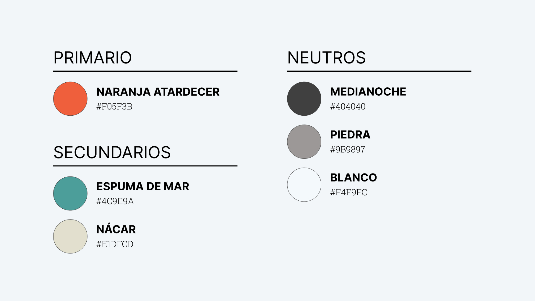
The color palette will give character to your emails and quickly associate your message with your brand. A very limited color palette will restrict the creativity of your template, while a very extensive palette may lose consistency. The key is finding a balance in between.
The color palette usually includes the corporate color, which is used as the primary color. Then, we add secondary colors that accompany the primary color, either highlighting it or complementing it. We can have up to 6 secondary colors. Lastly, we include neutral colors—black, white, and one or two grays—which are mainly used for backgrounds, texts, and borders.
Typography
Using a beautiful typography will make the design more attractive and increase the chances of our emails catching the attention of our recipients. However, using web fonts in an email is a somewhat complex issue, as their compatibility with some email clients is quite restricted (as we will see when we address email development).
-
Web font: It is important that the typography we use for our email is hosted on a Content Delivery Network (CDN). We usually work with two catalogs: Google Fonts (free) and Adobe Fonts (paid). Specifically for our design, we are going to use the font Inter, which is also available on the Google Fonts CDN. If you are unsure about which font to choose, take a look at our tips for choosing the perfect typography.
-
Fallback font: It is always necessary to select a fallback font for our templates, as some email clients do not support loading external fonts. For this, we need to stick to safe fonts (or web safe fonts), which are fonts that come pre-installed by default on major operating systems, such as Arial, Tahoma, Trebuchet, Verdana, Georgia, or Times New Roman. Our advice is to choose fallback fonts that are very similar to the web font, both in appearance and x-height. For example, for our template, we have chosen Arial (highlighted in yellow in the image below) as it is quite similar to Inter (highlighted in blue).
-
Font Weight: Once our typography is selected, we must choose the font weights we will work with, such as thin, light, regular, medium, semibold, bold, extrabold, black, and more. It’s important to limit the number of usable font weights, as an essential consideration is email performance (and more font weights lead to longer loading times for the email). Therefore, when creating text contrasts in an email, it is preferable to play with colors and sizes rather than font weights.
-
Color: Our recommendation is to always use very neutral colors (which are more comfortable to read) and limit them to only two colors: one dark color to use on light backgrounds and one light color to use on dark backgrounds. It is crucial that the contrast these colors provide against the background is appropriate. To ensure that, it is advisable to use one of the many online tools available, such as Colorable.
-
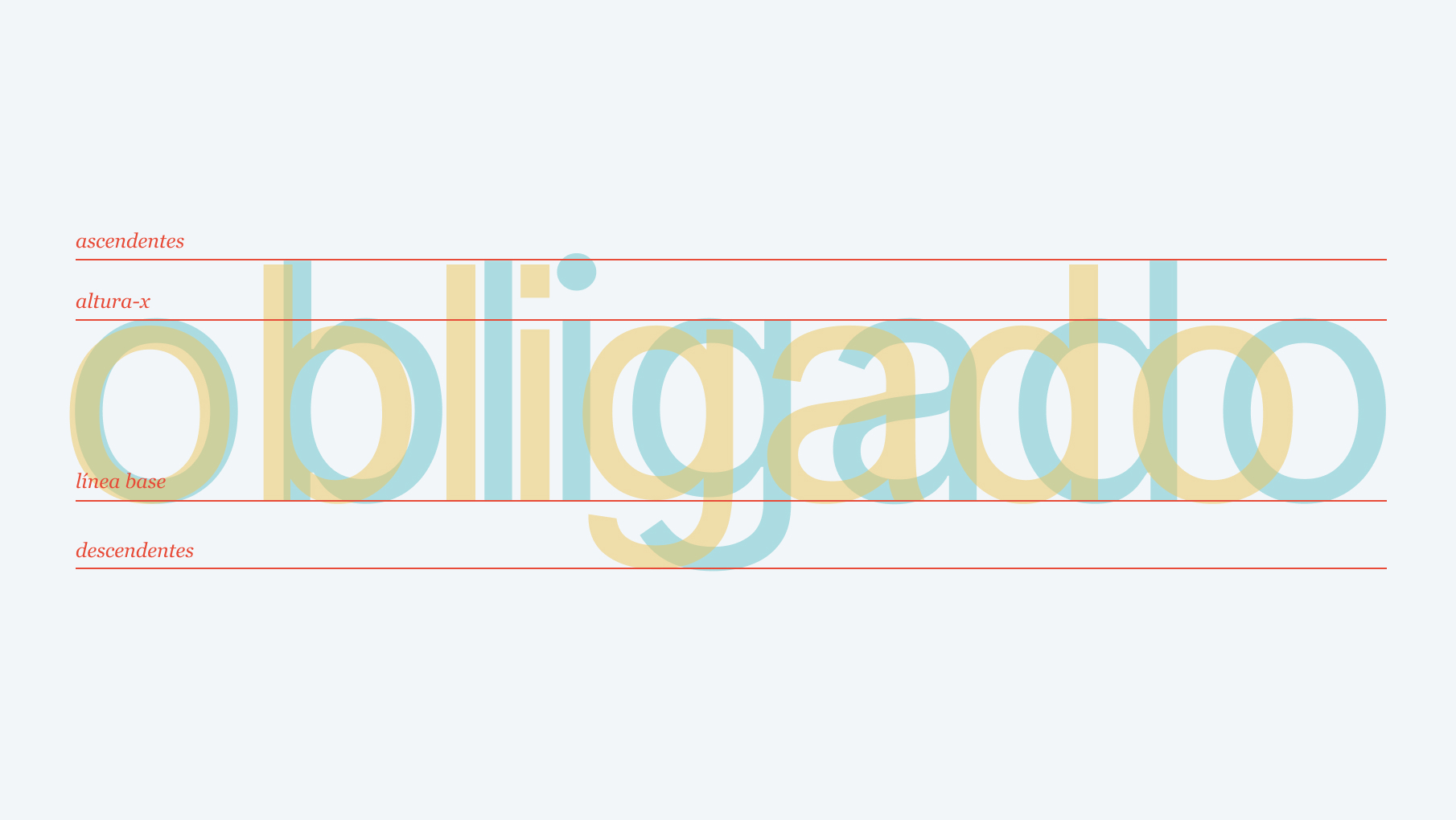
Font Sizes: Font sizes play a crucial role in information hierarchy. Using many different font sizes can create a cluttered appearance, so it’s best to use a limited number of font sizes. This concept is known as a ‘typographic scale.’ Start with the base text size for the email (we like to use 15 or 16 pixels), and then apply scale factors: x0.65 for small texts (e.g., legal text), x1.5 for highlighted texts, x2.25 for headings, x3.375 for the main title… For line spacing (interlineado), we always use values that are multiples of 6 to align the text baseline with the rows of the layout and allow for better element matching.
Modular Template
Once layouts and tokens are defined, we can start designing our template. Our advice is to work with modules. Most email editors of different ESPs (HubSpot, Pardot, MailChimp, Sendinblue, etc.) allow dividing the content of an email into modules that can be removed, duplicated, or rearranged to generate different content from the same template. Therefore, all these modules must be designed with this in mind, so that moving or removing one of them does not alter the final design of the email as a whole. For instance, we apply the same top and bottom margins to all modules.
Which modules should be included? Obviously, the answer depends on each company. However, when listing and designing them, we always have to consider the inverted pyramid structure.
The inverted pyramid consists of presenting the main idea at the beginning without revealing all the details, so that the recipient quickly understands the message while being interested enough to want to know more. This structure has a purpose: if the user suddenly closes the email, they will have seen at least the most crucial part for our interests.
Following this system, emails are divided into blocks that act as filters to retain the user and encourage them to click on one of the links.

First Level
Every email must have a clear objective, which should be explained in the first module with a title, a small text (optional), and a call-to-action that preferably appears before the first 650 pixels of the email’s height. This measure usually ensures that the message remains above-the-fold, meaning it is visible to the recipient once they open the email without needing to scroll. For these types of modules, you can design multiple versions, but they usually occupy the full width of the email (our twelve columns) and present a powerful design that should visually capture attention. They include a header with the company logo, which is usually consistent from one email to another to maintain consistency.
Second Level
After the first module, secondary modules follow, which essentially break down the information from the first level but focus on more specific aspects, trying to convince the user with additional arguments. Each module has its own call-to-action, directing users to the same location as the call-to-action of the first module, but usually with different text. Their design is usually more discreet, and they are commonly found in two columns (6+6), typically with an image on one side and text on the other.
Third Level
If the user navigates through the first modules without clicking, they reach the tertiary modules, which function as ‘safety nets’ to try to engage users who were not attracted by our main appeal to take some other action that could also be useful to us.
Fourth Level
And so we reach the end of the email, the footer, where we place some generic links to the most important pages of our site.
The footer is also the place where we must include the legal disclaimer. This section can be somewhat sensitive. Sometimes, some of our clients request not to include this part in their emails. However, if you want to comply with the GDPR (General Data Protection Regulation), and you should want to comply with it, it is essential that all automatic emails include a legal disclaimer that offers recipients the option to unsubscribe from the subscription and provides a link to the company’s privacy policy. Moreover, all ESPs (Email Service Providers) we have worked with (HubSpot, Pardot, MailChimp, Sendinblue, etc.) require including this section before sending any email.
In the footer, we also include social media links. We are not advocates of including them before the footer because they tend to act as escape points: distractions from achieving our main objective.
Final Tip: Dark Mode
Dark mode is an option that allows changing the color scheme of devices, displaying content with light colors on dark backgrounds instead of the traditional ‘black on white.’ It was introduced by Apple in 2018 (with MacOS Mojave), and since then, other operating systems have adopted it, gaining significant popularity among users. It causes less eye strain and, above all, results in considerable battery savings, as screens emit less light and require less power.
Dark mode also affects the way we view emails, although not all email clients implement it in the same way. Some clients only change the color scheme of the user interface while maintaining the colors of our emails, while others invert the colors. Therefore, it is essential to include a version of our template in dark mode to ensure that it always appears well-presented.
Once the design of the email template for your company is ready, the next step is to develop it in HTML to make it fully responsive and compatible with major email clients, including Outlook. Finally, you will need to integrate it into the Email Service Provider (ESP) from which your company sends emails. It could be platforms such as Pardot, MailChimp, Campaign Monitor, HubSpot, Sendinblue, among others. Each of these platforms has its own process to make the template content editable from an editor without the need to access the email code. At OKB Interactive Studio, we specialize in the design, development, and integration of email templates. Get in touch with us, and we will help you have a personalized, robust, and versatile email template that can improve your conversions.
Did you find this post interesting? Share it!
Your contacts will like to read it, for sure!


